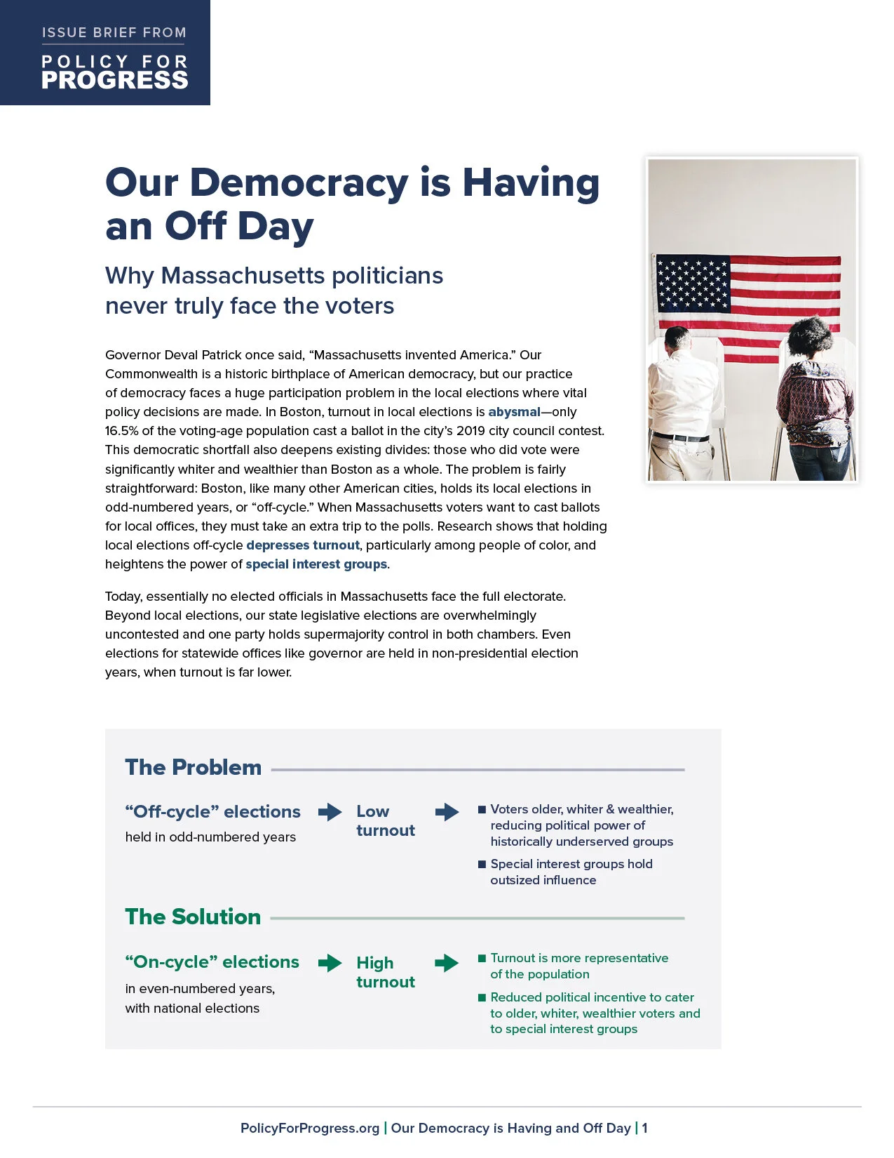
Thinking beyond the paragraph

We worked with Policy for Progress on an issue brief advocating for on-cycle local elections (which was featured in the Boston Globe!). Their argument is that holding local elections on-cycle (with national elections) increases turnout, especially among people of color. White voters are much more likely to vote in off-cycle elections, giving them disproportionate influence in local politics.
We used a few techniques in designing this brief to make the argument clear, the content accessible, easily digestible, and scan-able in case people didn’t want to read the entire narrative. Read about them below.
think beyond the paragraph
This brief, like most, was written in a narrative form. It flows linearly, so viewers would be expected to read it from start to finish. Sometimes though, this isn’t the easiest way to digest information. It asks a lot of the reader. A few techniques we use to make content easier to digest are described below.
1. Diagram out the argument or main point. After reading through the text, we think about the main point and how it can be diagramed. This brief makes a pretty simple point of off-cycle leading to one set of outcomes and on-cycle leading to another set. Of course, this can (and is) written in paragraph form. But as a simple diagram, it’s much clearer. You see immediately the two options, their effect, and then the outcomes from that effect. Often, this process will help our clients clarify their own thoughts about what they are trying to say.
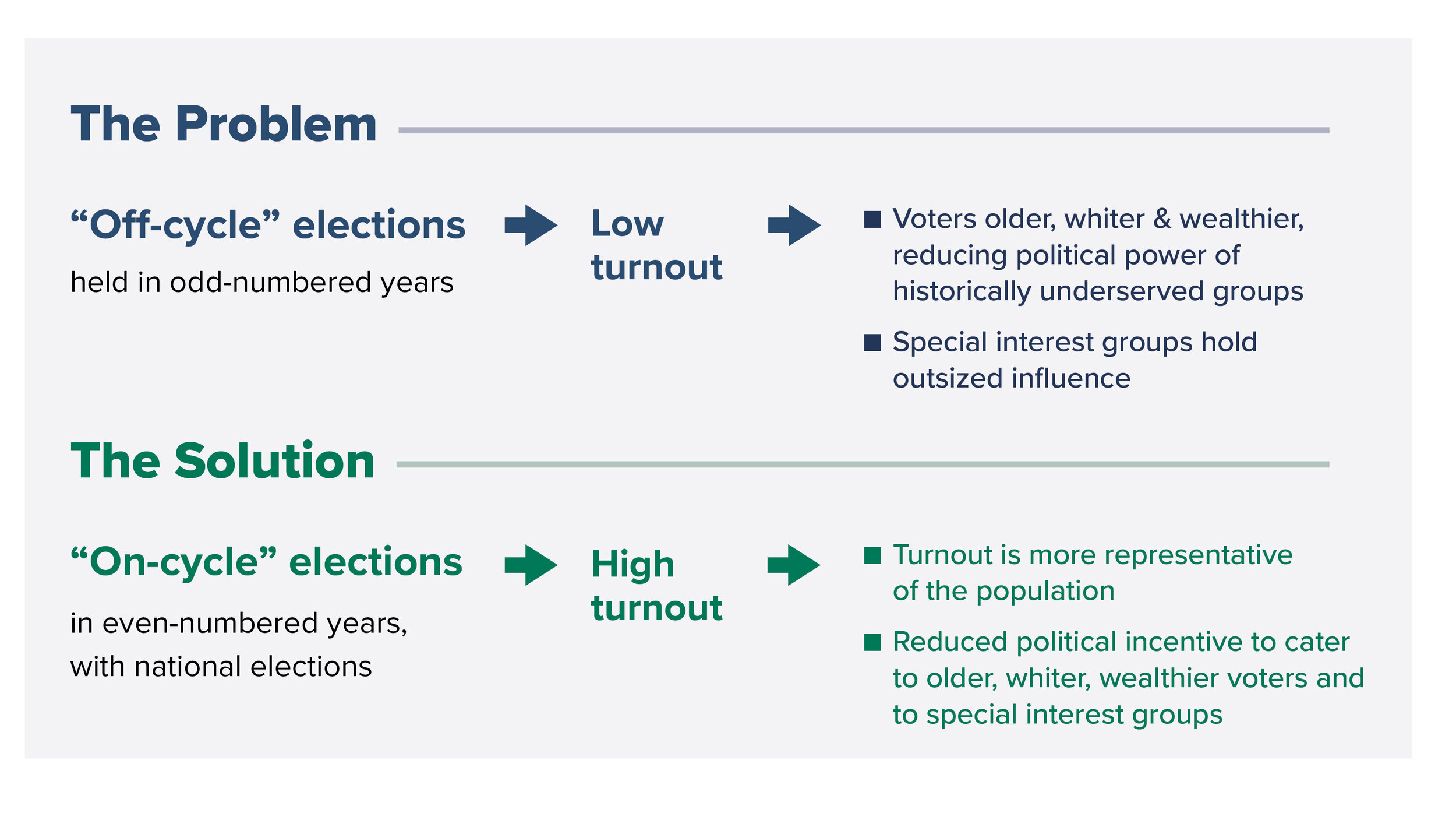
Diagram of the main point

Another way that we diagrammed the main point

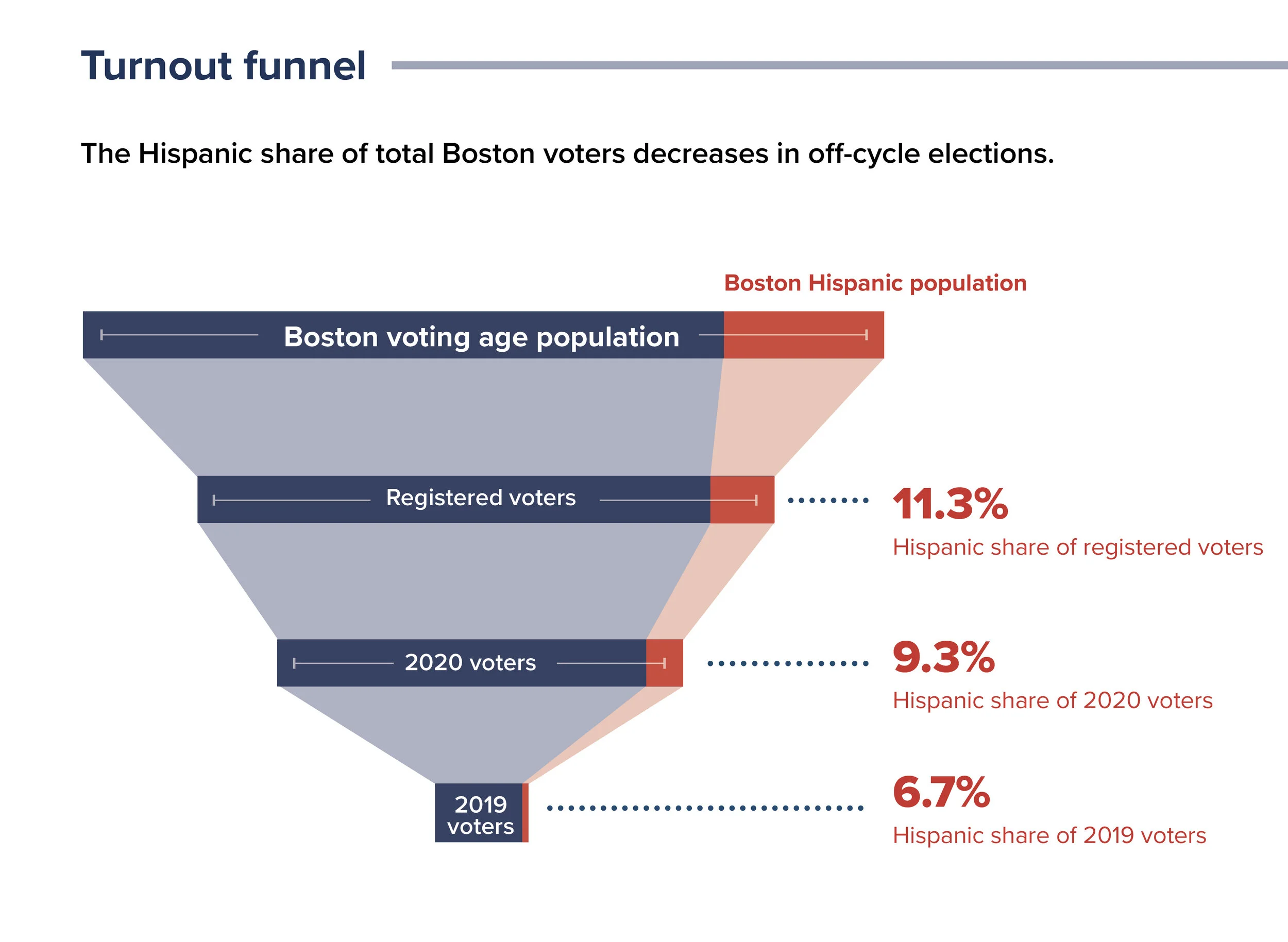
2. Visualize numbers. When data (numbers) are mentioned in the text, create graphs to showcase these numbers. This may be obvious, but seeing numbers visually compared to each other is easier for the brain to process than reading and comparing them.

3. Pull out content as sidebars, lists, call-outs, or captions on images. In this example, you can read the header and the bolded city names at the beginning of each paragraph and get the point before you even read most of the copy. Often lists are hiding in paragraphs. We search for these instances and pull them out as sidebars or callouts next to the paragraph with a title and a series of bullet points. A reader can then see this and immediately know that the items in the list belong in the category indicated in the title. Again, we are trying to make it easier for the reader to understand the content before having to read all the text.
4. Establish a thoughtful typographic hierarchy throughout the document. After determining the main points, sub-points, sidebar content, etc., we design the document with consistent type sizes and weights that support the hierarchy. Ideally, someone could scan through it and know the gist without reading any of the body copy. This brief is relatively short (6 pages), so you don’t need a complex hierarchy. Still, it can help to color-code sections for longer documents and make the hierarchy more obvious to make navigation easier.