


Inclusive Action Toolkit
We designed a booklet to go along with the Breakthrough documentary film series about women scientists produced by Science Friday. The booklet is intended for a higher education audience, and includes implementable tips for creating an inclusive learning environment in university STEM departments.
Read more about the design process below!

Optimizing the organization
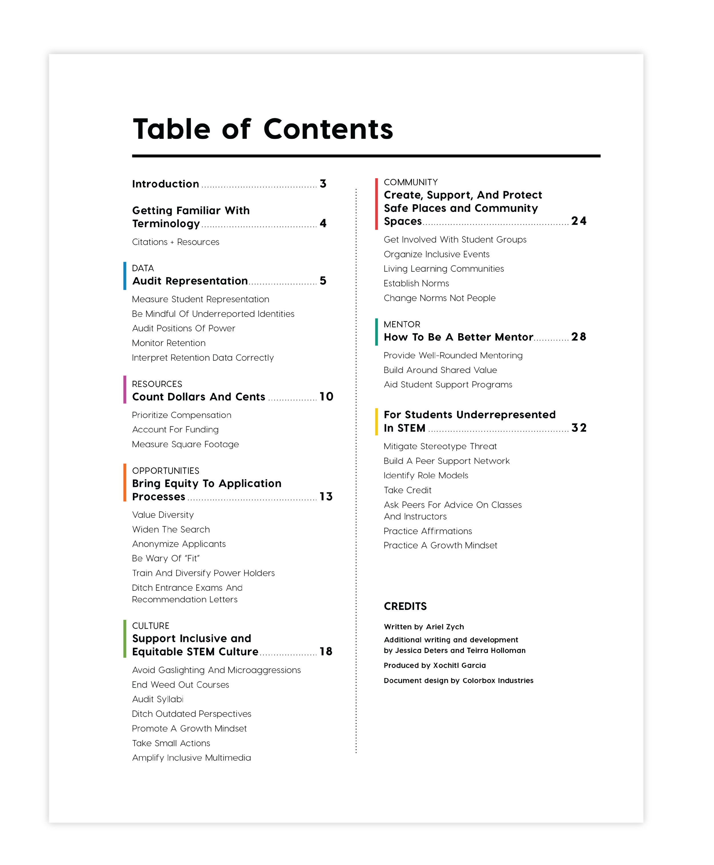
The document was originally in two sections, one for professors and administrators and one for students. The student section was only one chapter though, so the two sections held very different weights, which we thought may be confusing for readers when trying to wrap their minds around the hierarchy.
We decided (with our client’s blessing of course!) to remove the section headers, so all the chapters are equal, and the last one (the one geared toward students), specifies that audience in its title. When we can simplify the hierarchy of information we do.
In order to improve readability and usability, we also pulled the subsection titles in each chapter out as a checklist at the start of each chapter. This allows the reader to know what they will find in the chapter, as well as reminding them to take action steps toward the goals.

How to integrate the film stills
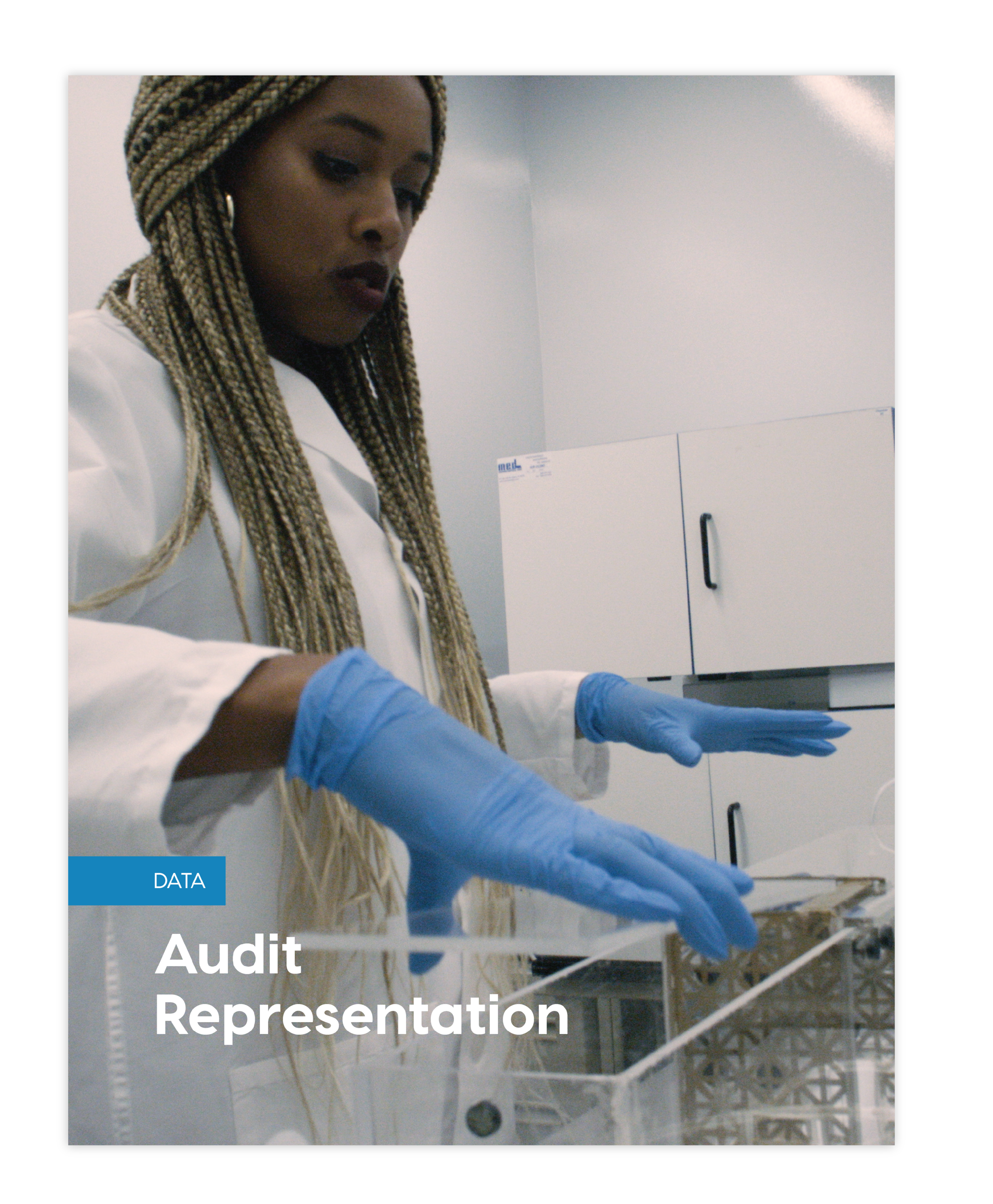
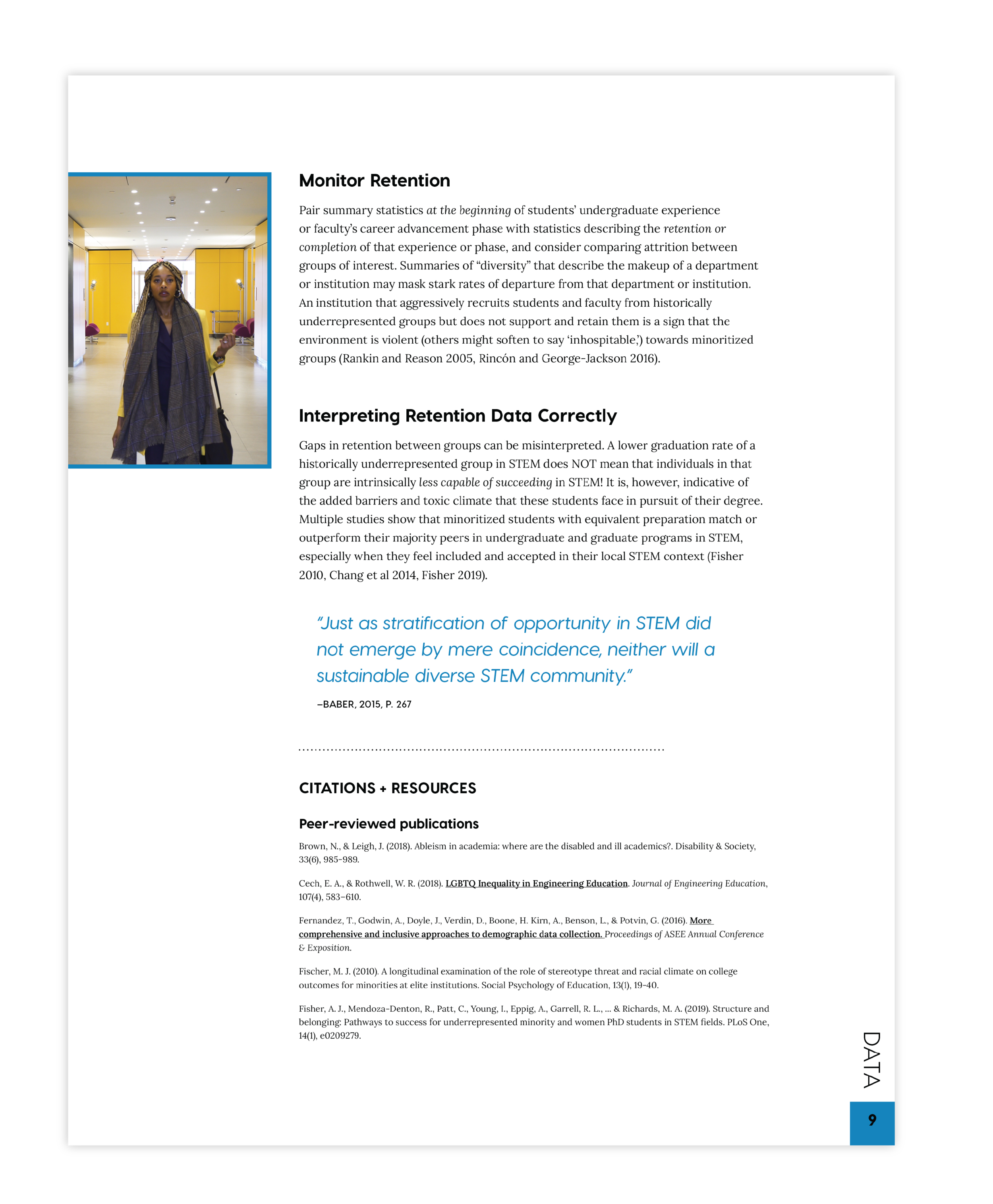
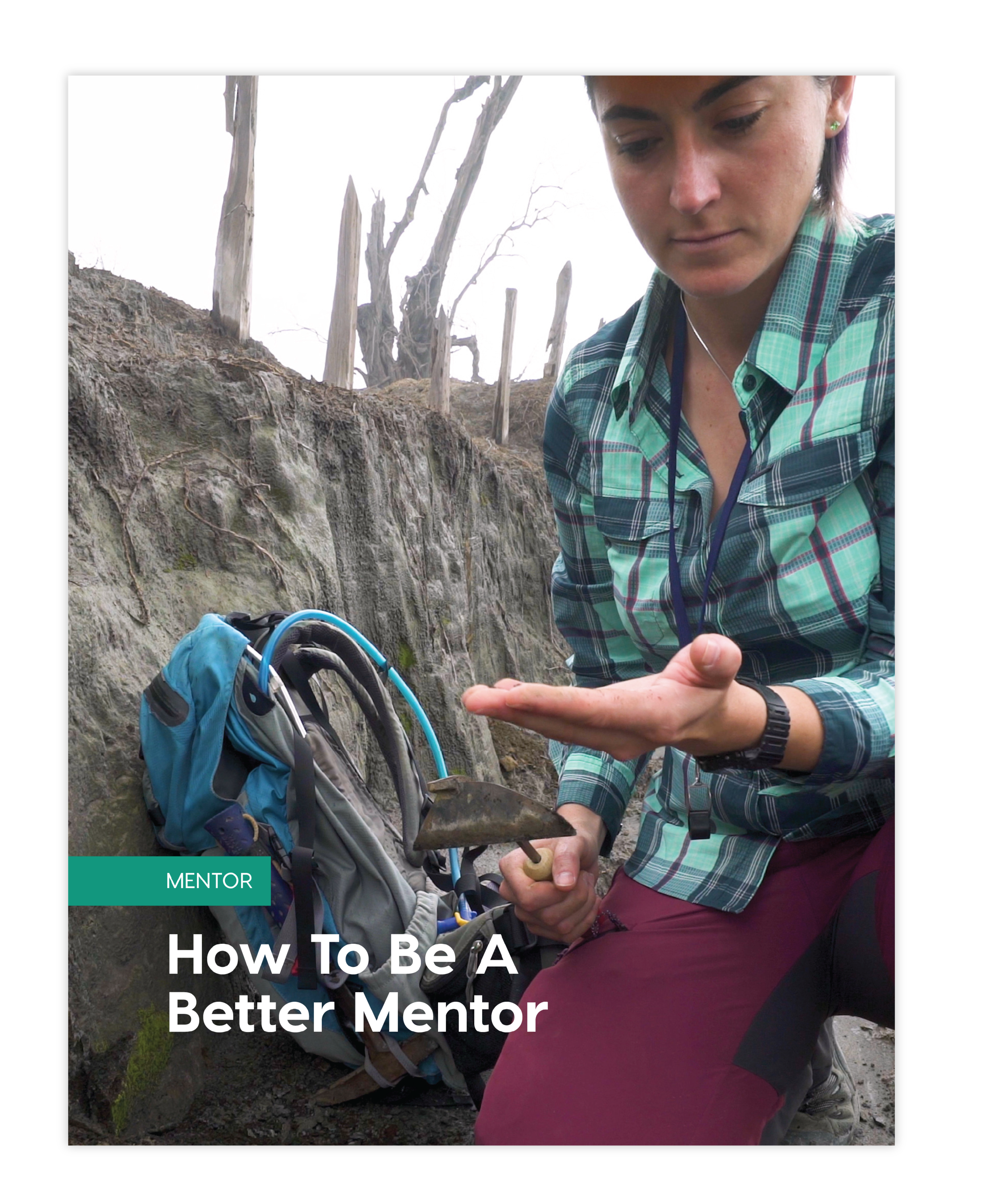

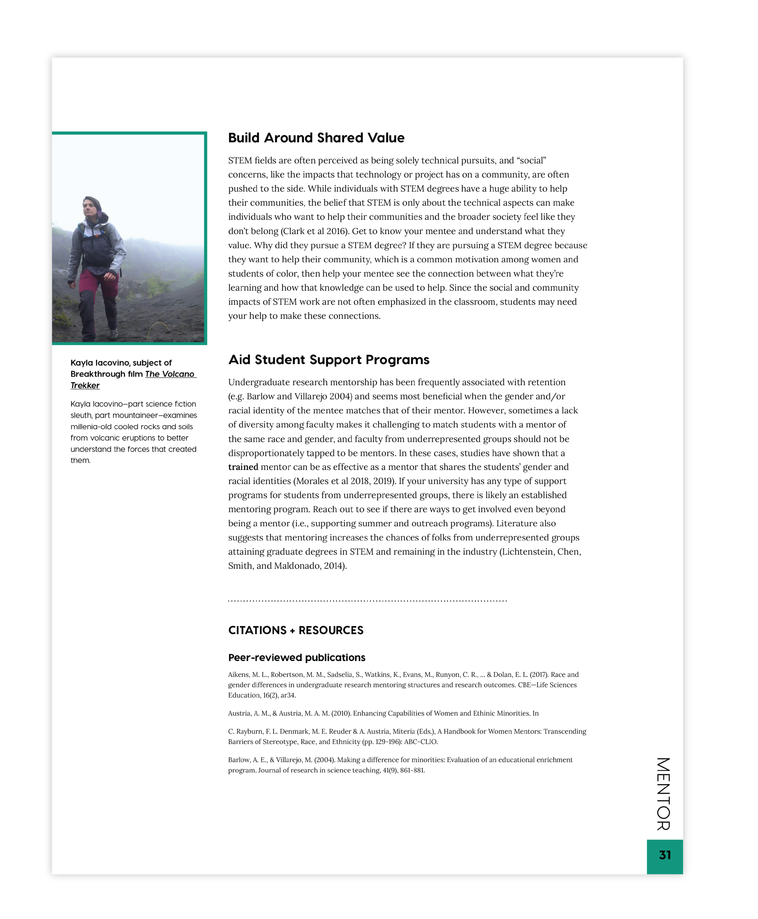
We had the challenge of how to integrate the beautiful film stills of the women scientists into this booklet. They do relate in that the booklet accompanies the films, but the content doesn’t directly correspond. We decided to pair one scientist with each chapter, and to tell a snapshot of their stories through the photo captions. So the cover page for each chapter has a full bleed photo of the scientist, and subsequent pages throughout have smaller ones.
This solution brings visual interest to the booklet, and also teases some of the content of the films, so if readers want to learn more about these scientists they can watch the films.
Stylizing
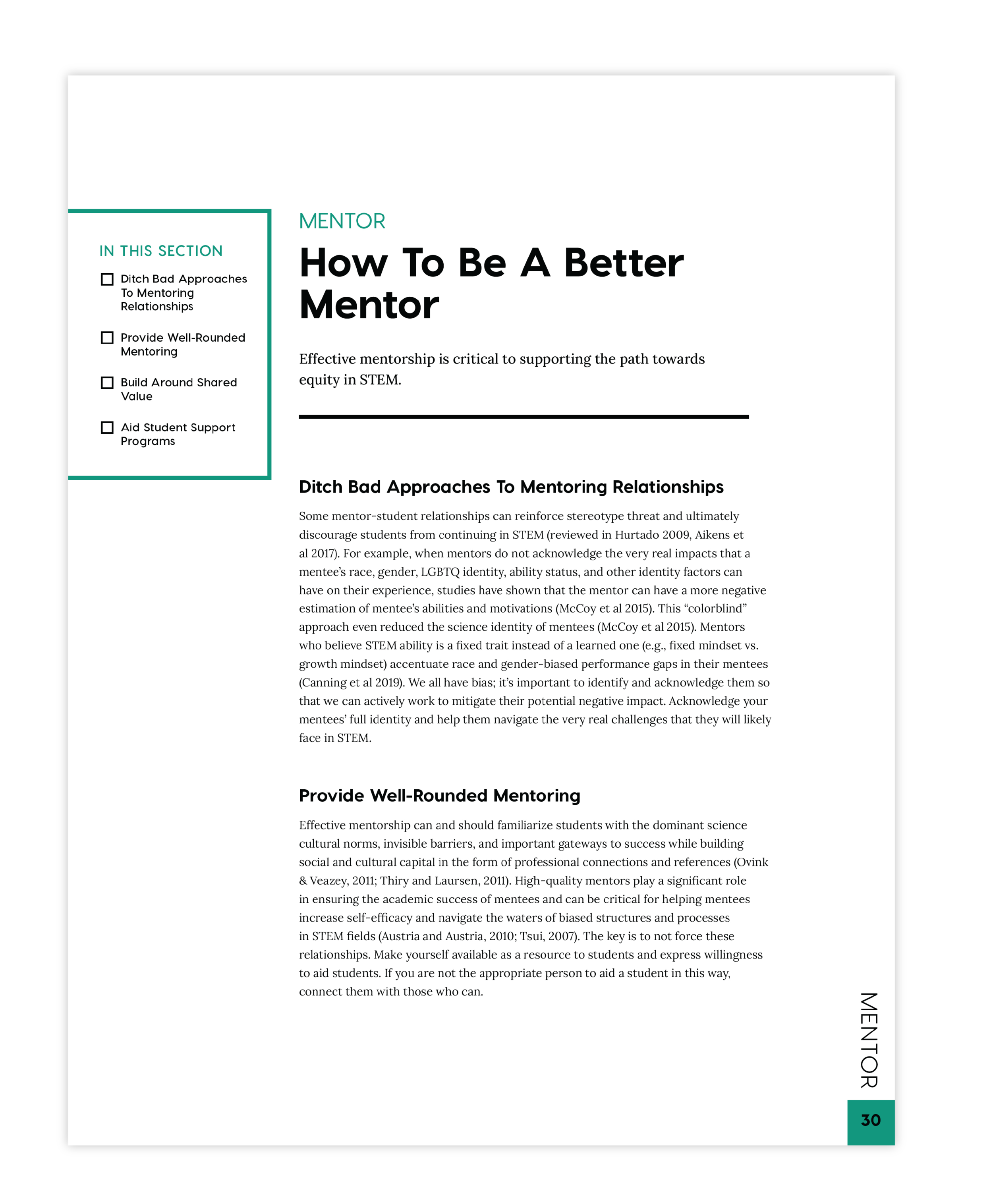
We wanted the booklet to have the same look and feel as the Breakthrough film series and its website. They use a very black and white aesthetic, so we continued that look throughout the booklet. We added a bright color to each chapter to differentiate them from each other, which we pulled from the films themselves.
The bright accent colors are used very sparingly. In this example, you can see the accent blue as a stroke around the film still, as the text color for the pull quotes, and small rectangle of color in the sidebar that indicates what chapter you are in.

Screenshot of the Breakthrough website.

