
Designing a voting rights exhibition
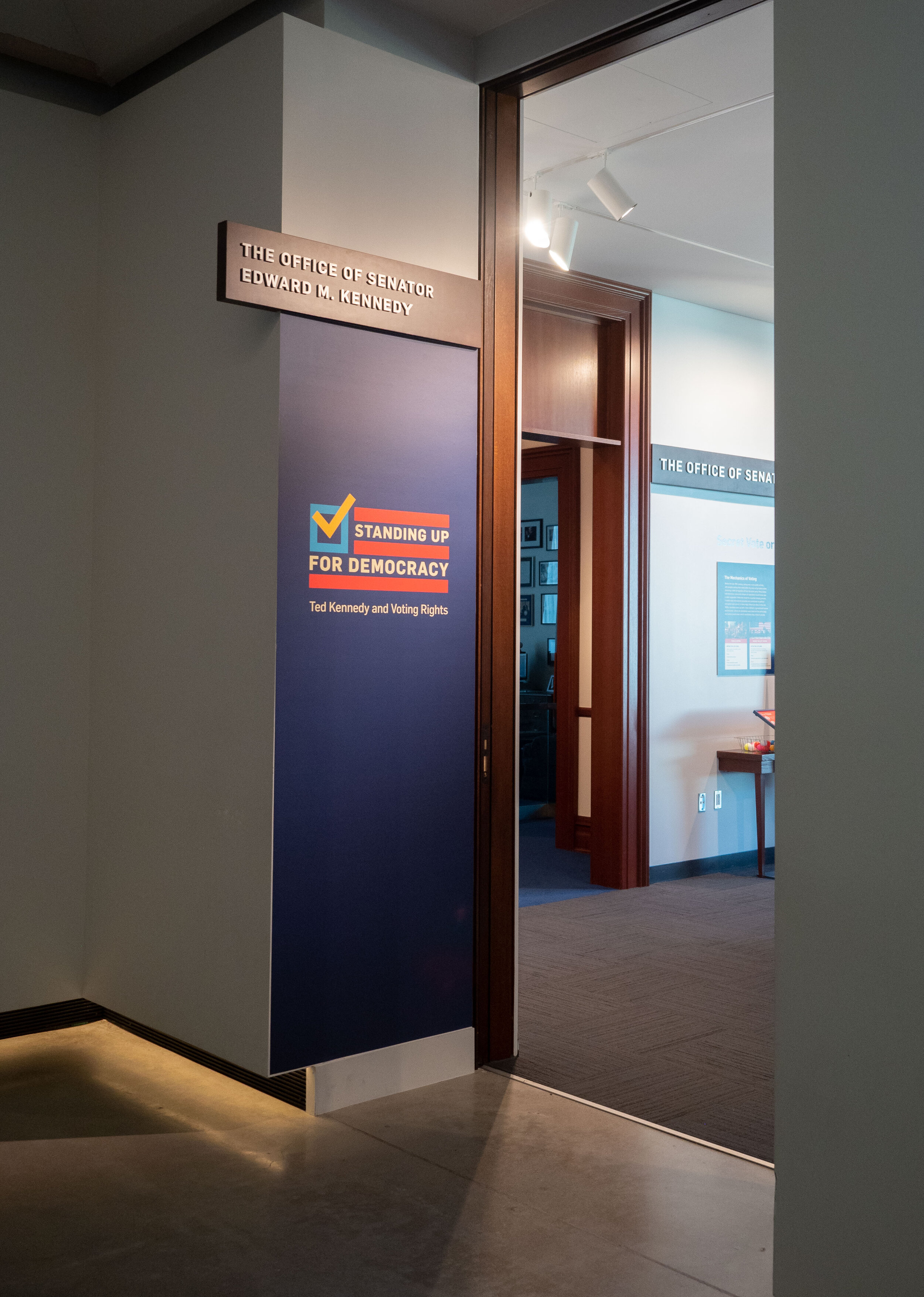
We had the honor of working with the Edward M. Kennedy Institute on their new exhibition about voting rights in America, and Senator Kennedy’s role in fighting for voting rights. We were responsible for designing the graphics and the overall look and feel of the exhibition, collaborating with their VP of Education on organizing the content, laying out the floorplan, and managing the print production process.
See more photos and read more about our process below!


Step 1: Organize
When we received a draft of the label copy from the content developer at EMK, our first task was organizing it. This can be a messy and creative process (hello, marker and paper!), moving things around and trying to get a ‘big picture’ view of the content. Sometimes you have to see everything in one place to really wrap your mind around it. Themes and design ideas emerge from this process, as well as spotting where the holes are.
In this organizing process, we aren’t thinking specifically about style. Any fonts, colors, and to some extent, layout, is purely a placeholder. The process of coming up with the look and feel can happen at the same time, but they’re on separate tracks.
We presented the overarching graphic that we created (once it’s cleaned up) to our client to make sure we were all on the same page, and to address any issues that become apparent.
Our process includes
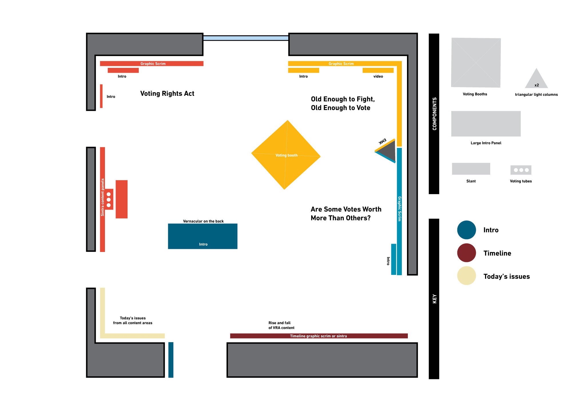
Defining all the sections of the exhibition, and what ‘types’ of graphics there are in each section.
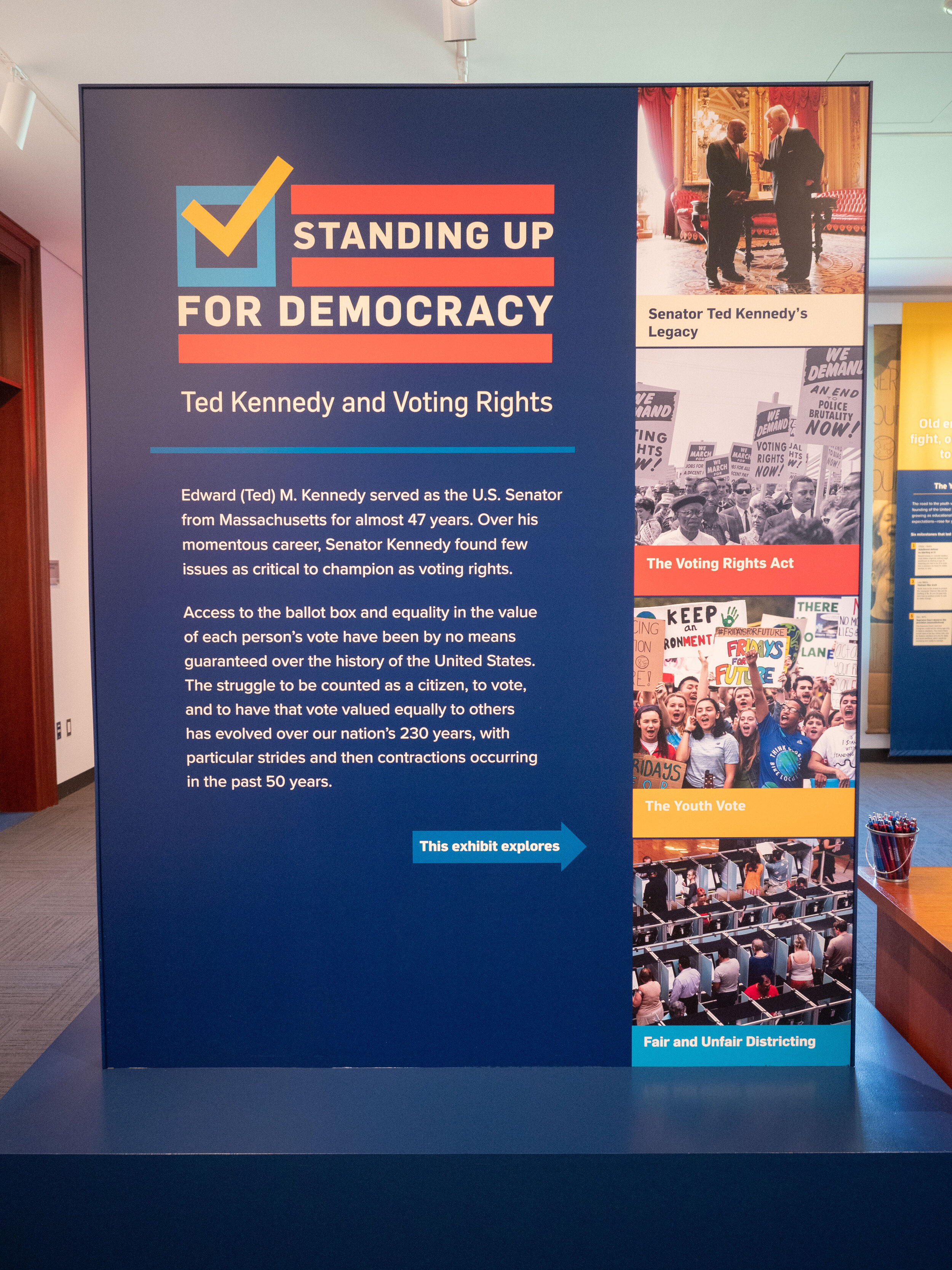
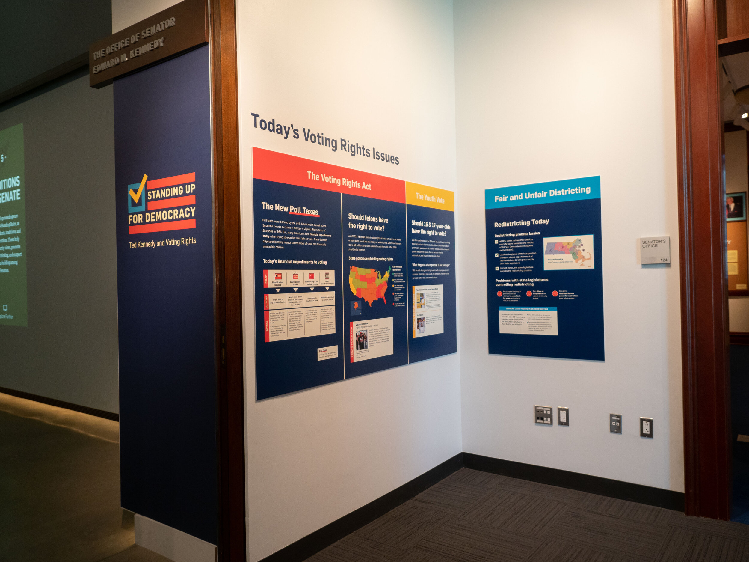
Making sure each section was equal and parallel in structure, so each had an intro graphic, a graphic about Senator Kennedy, a graphic about today’s issue, etc.
We look for themes and threads throughout the content to emphasize graphically.
We look for and try to define a clear hierarchy across the exhibition and within each panel.
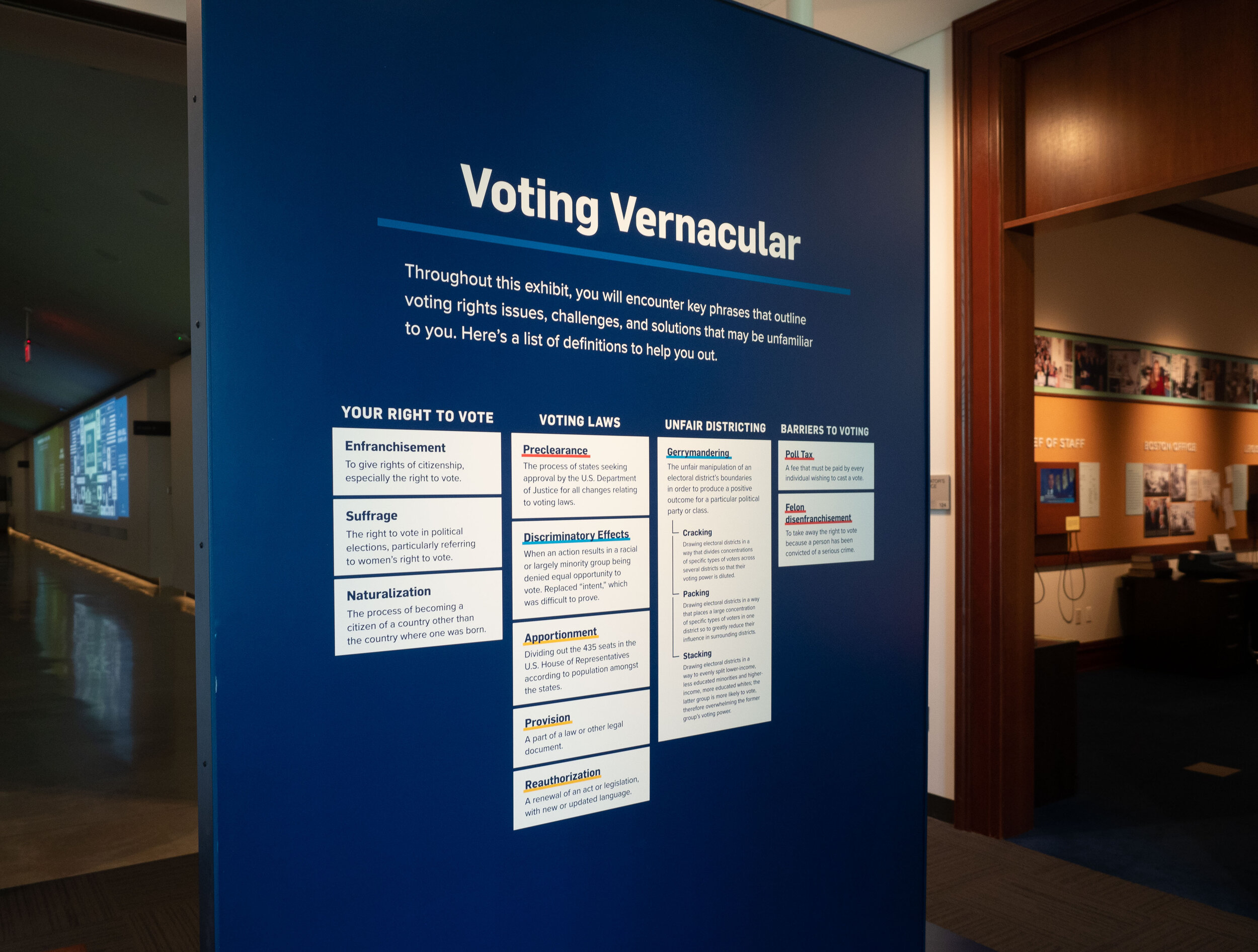
We look for areas of content that can be visualized so that we can eliminate text and replace it with visuals. We do initial sketches of these visuals.


Step 2: Visualize
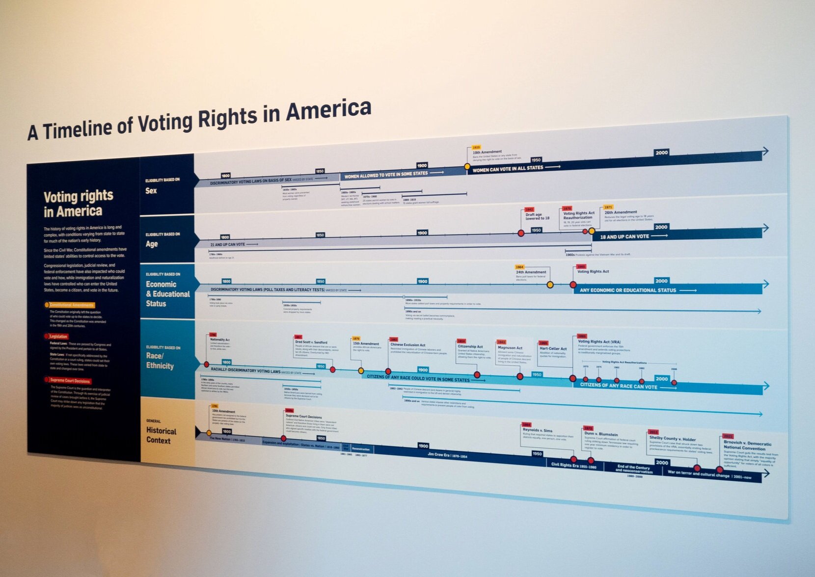
Spotlight on the timeline
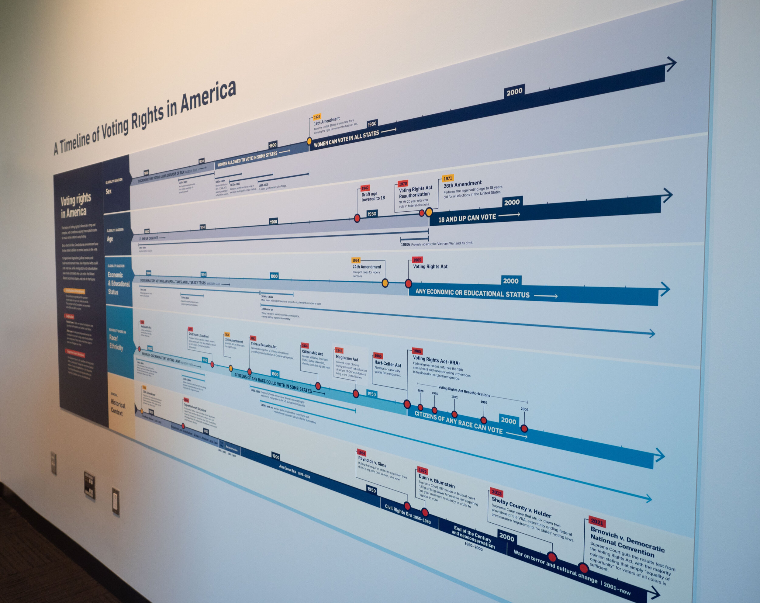
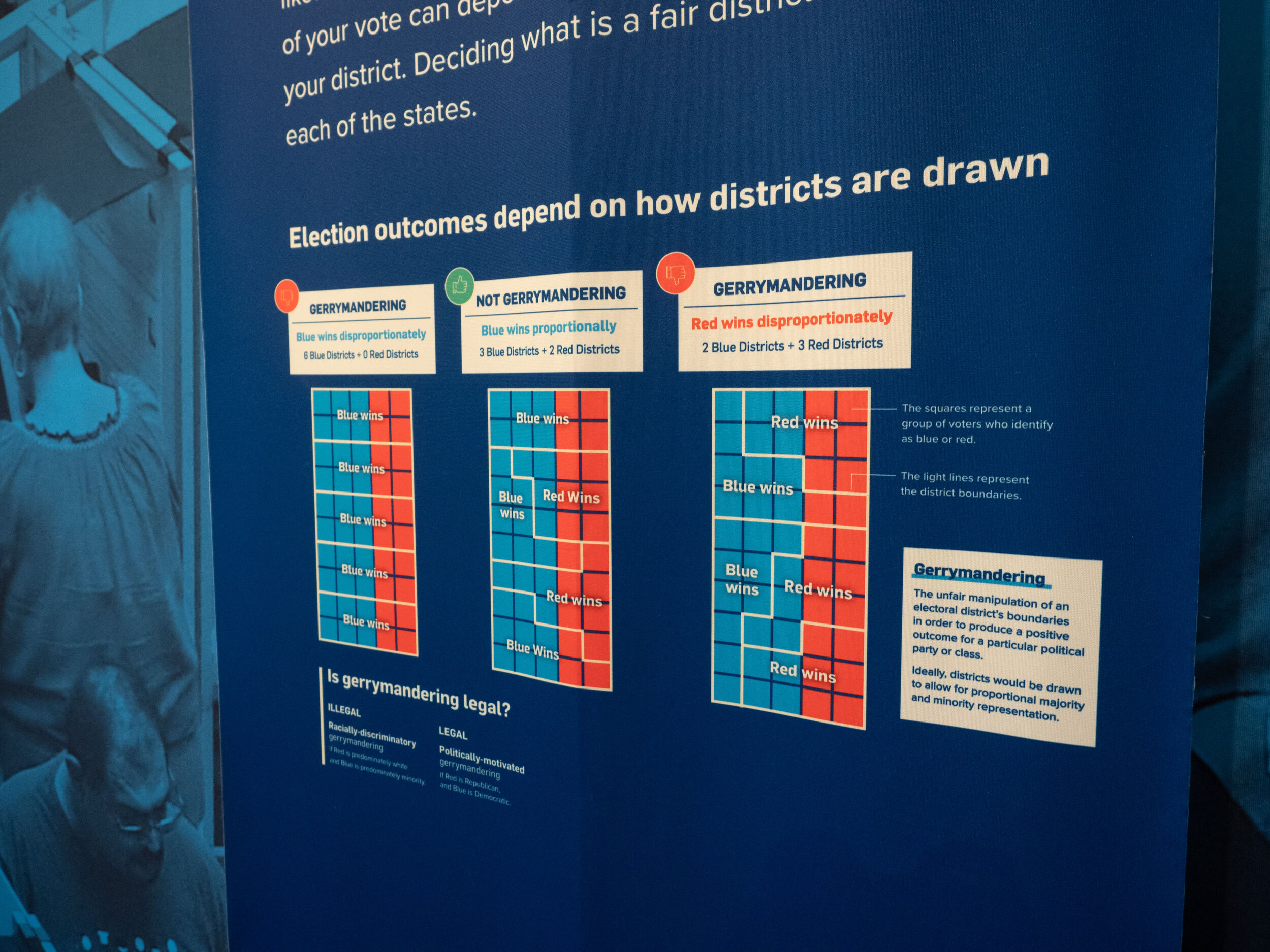
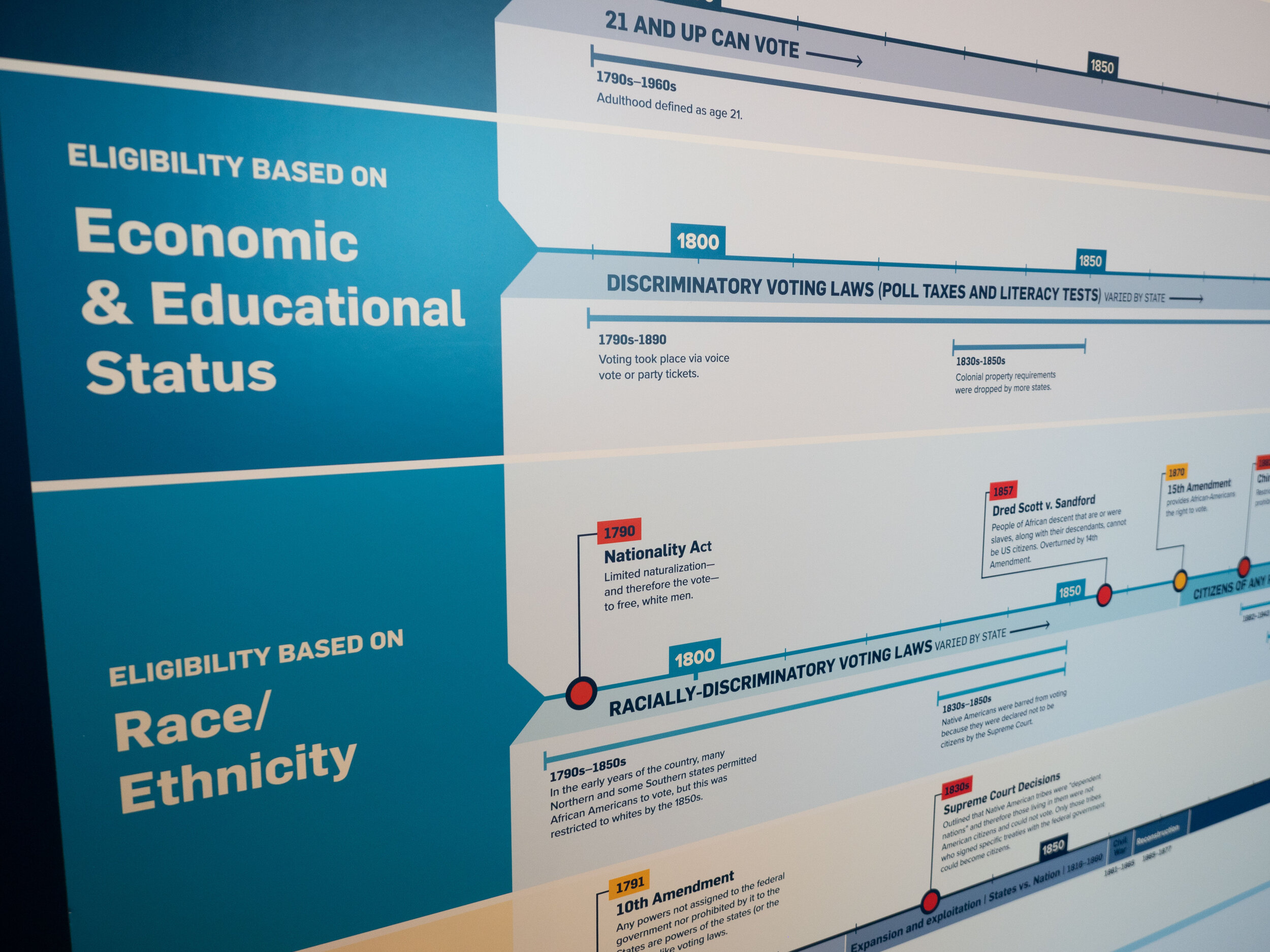
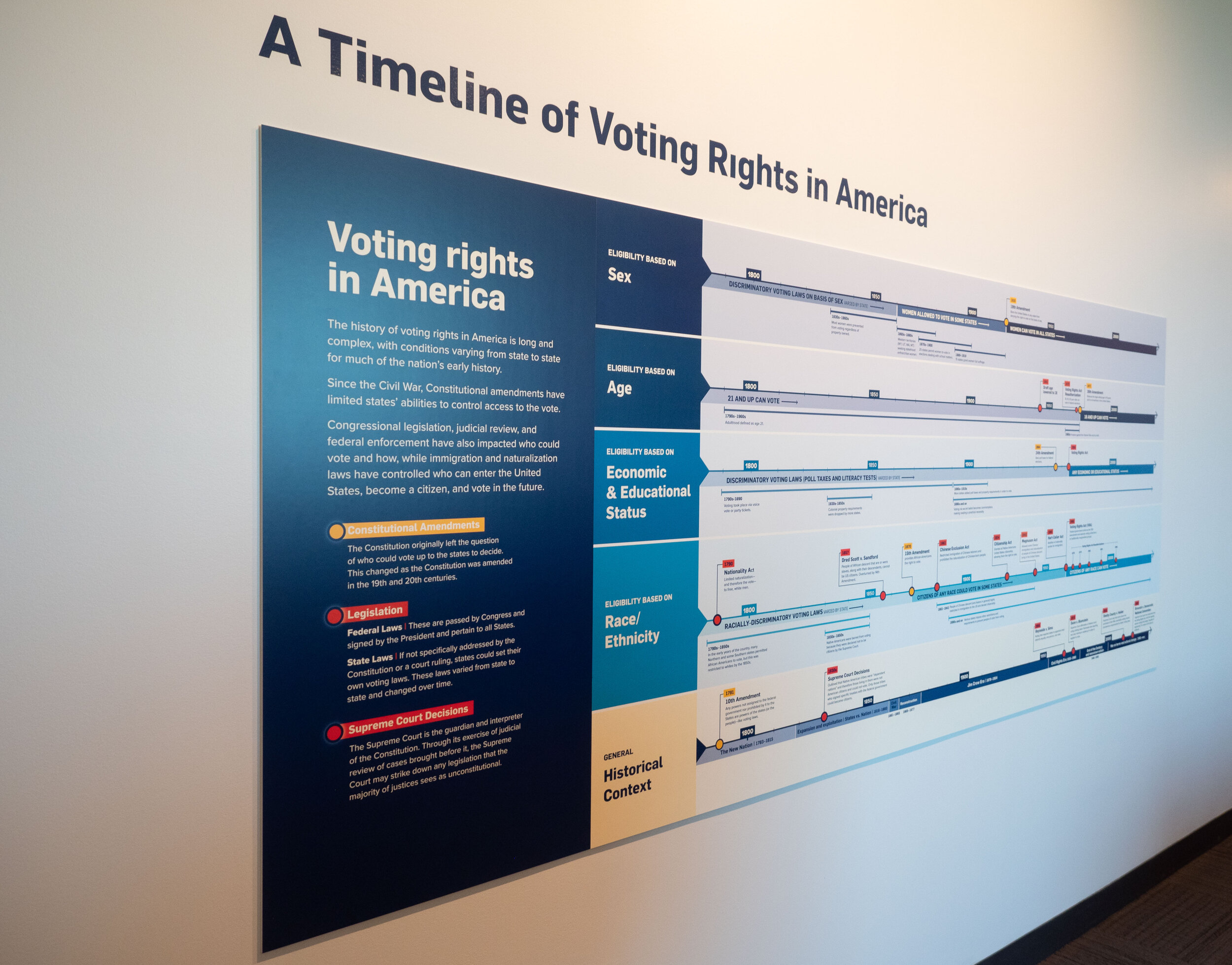
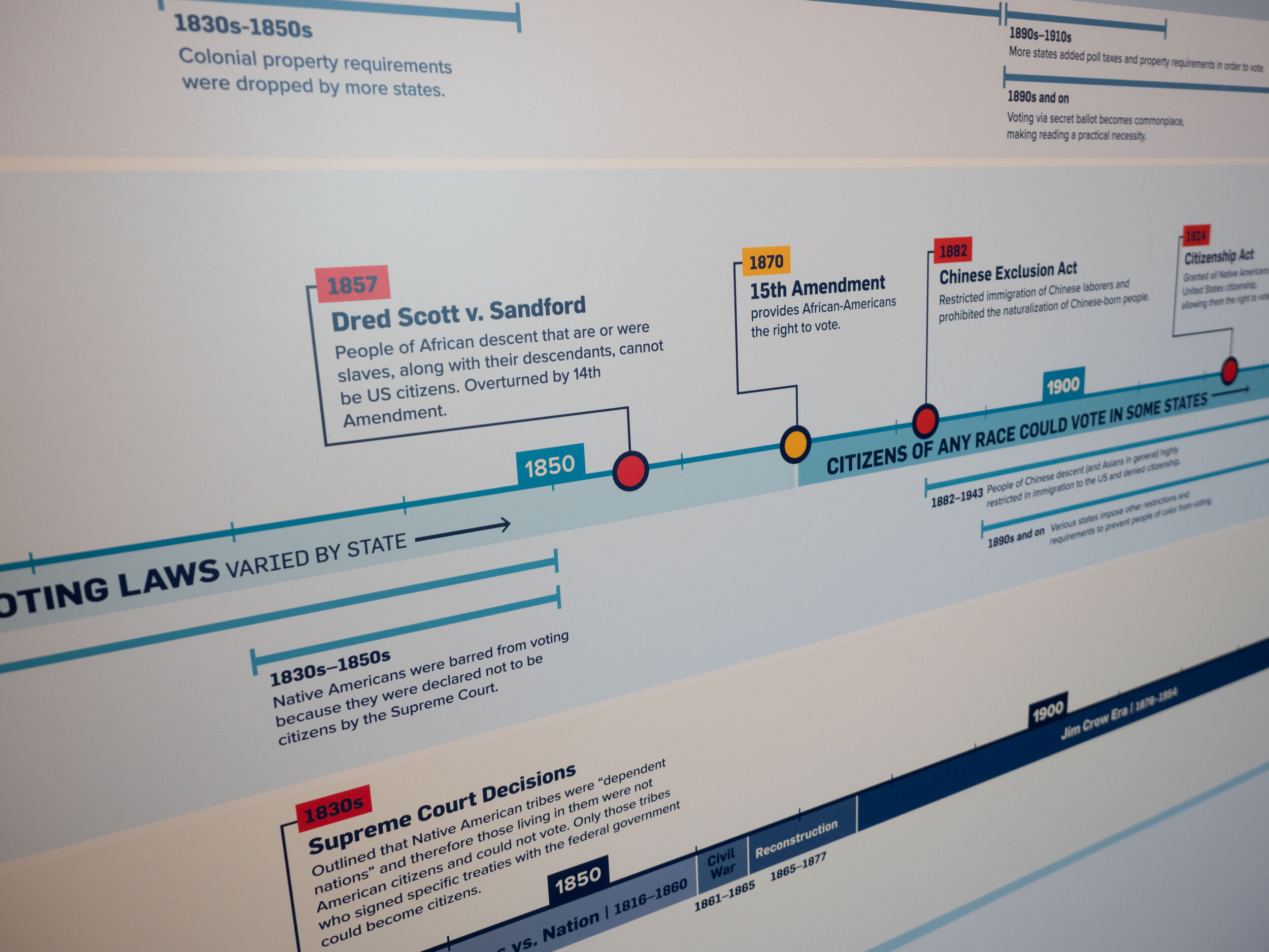
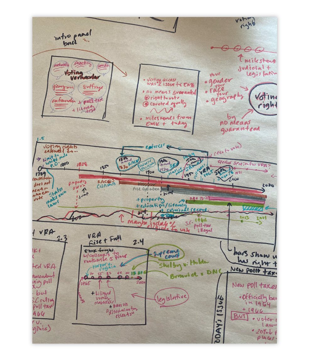
One particularly challenging graphic was the overarching timeline of voting rights in America. This is an example of when a lot of information is okay as long as it’s organized in a relatively simple way. Our goal is for the viewer to be able to quickly understand the big picture, and then dive into the individual details.
When first reading through the content, we had the idea that the timeline could be organized through the lens of Constitutional Amendments, Legislation, and Court Decisions—the greatest three influences on voting rights. While the timeline was primarily organized through those three categories, we also sketched out a sections showing indications of group eligibility – so when women were federally granted the right to vote, non-white people, varying levels of economic and education status, etc.
Final Design of the Timeline
As we worked on it more and had conversations with the team at EMK, we realized that the group eligibility was actually the more interesting and important framework. So we essentially took that section and expanded it to be the whole graphic, and fit the individual events within those categories (for example, all milestones related to womens’ suffrage went in that section). The lens of Amendments/Legislation/Court Decisions was shown through color-coding within the new sections. As we thought it through, we realized that this would allow visitors to more easily relate to the historical events, like “what milestones paved the way for me to become eligible?” If a viewer doesn’t want to read the nitty-gritty details of the events, they can see at a glance when the group became eligible.
evolution of the timeline design


Step 3: Stylize
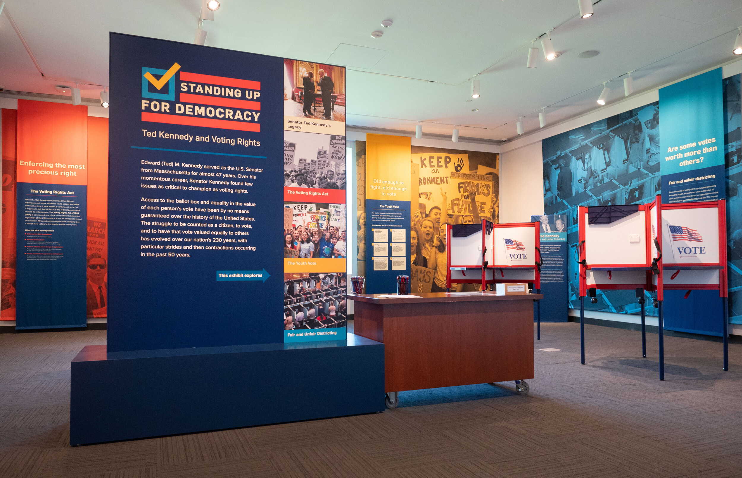
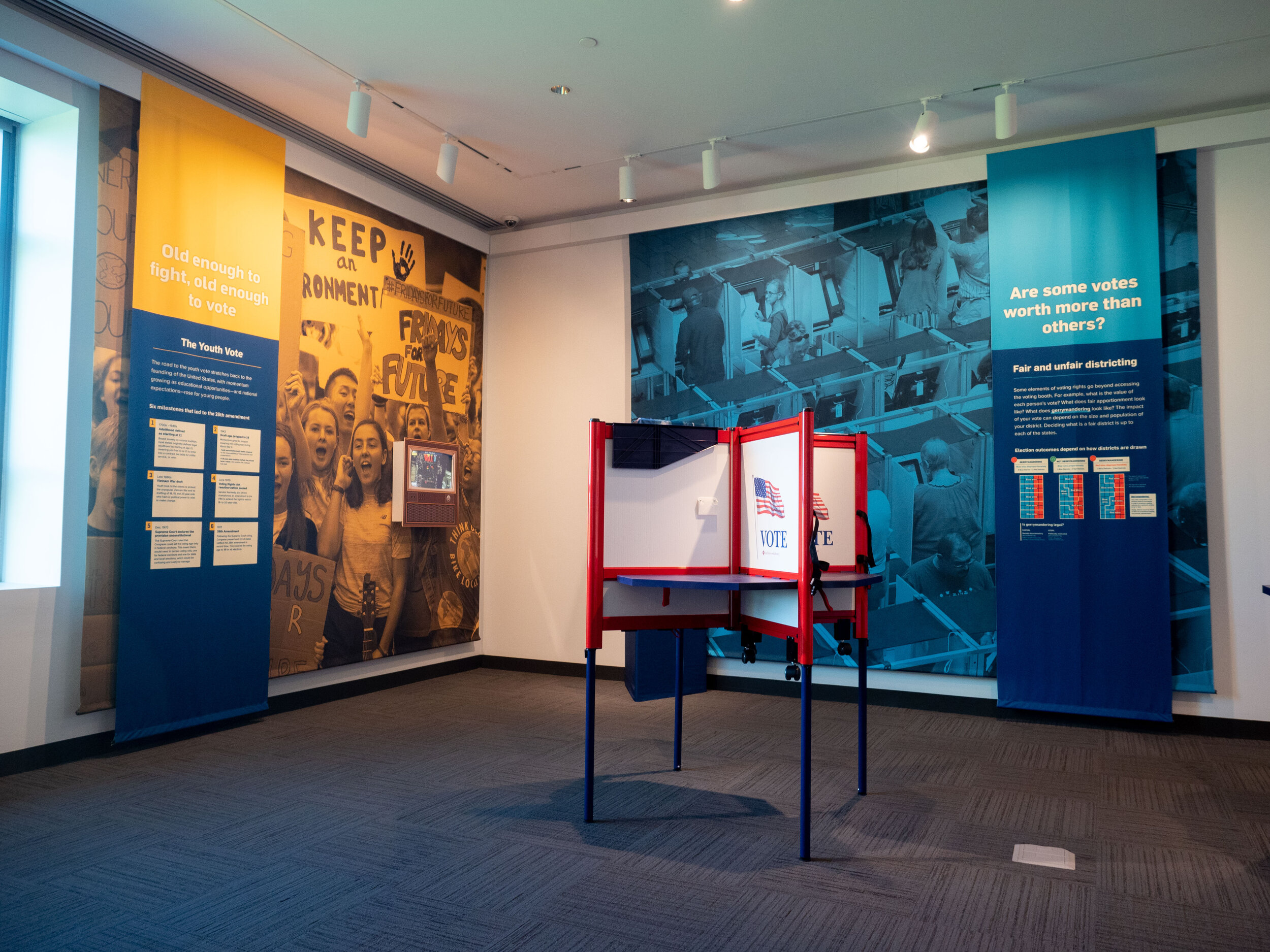
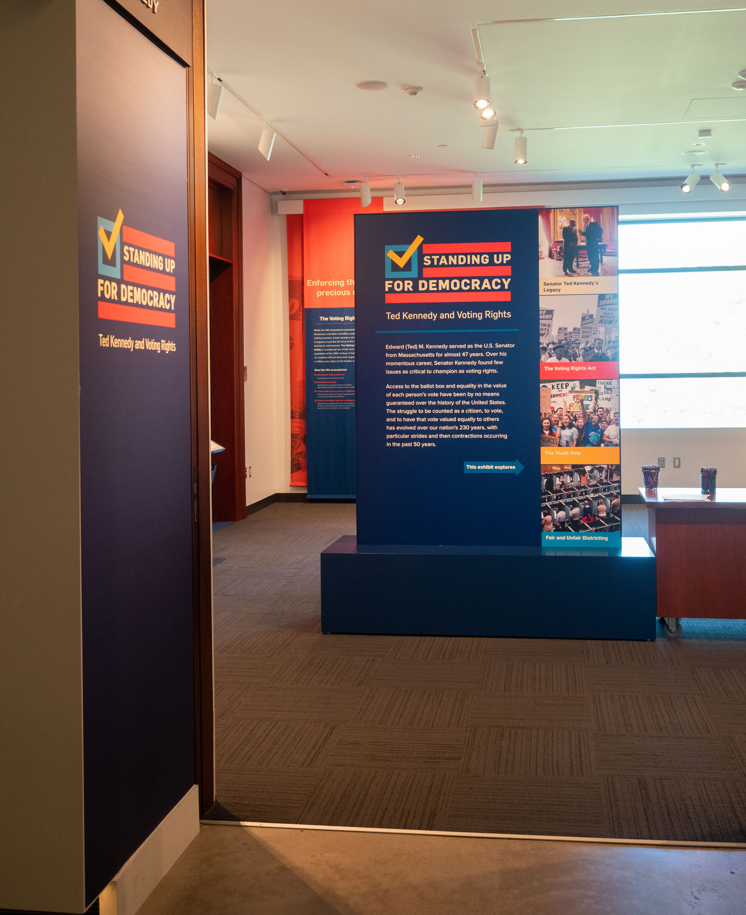
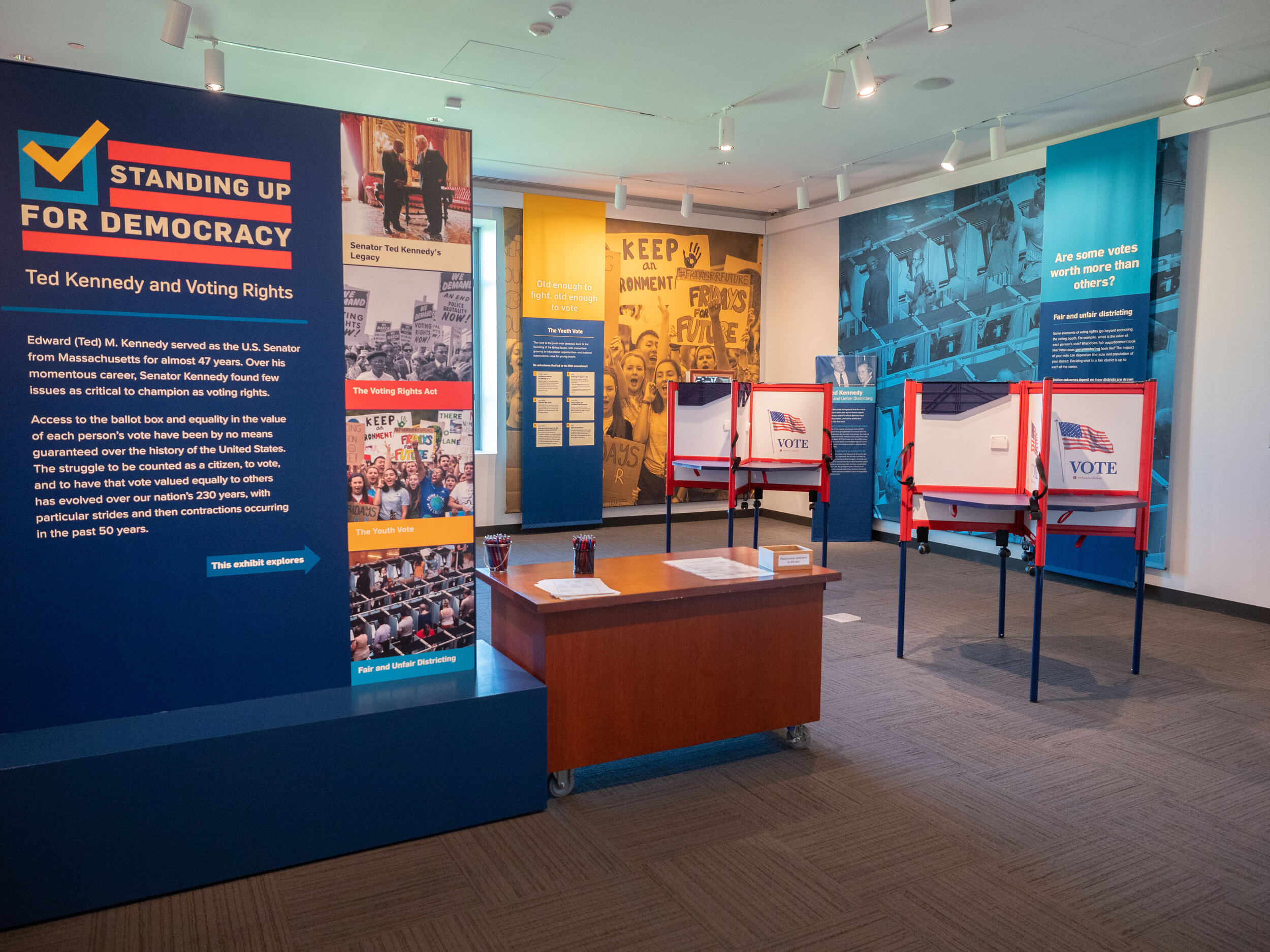
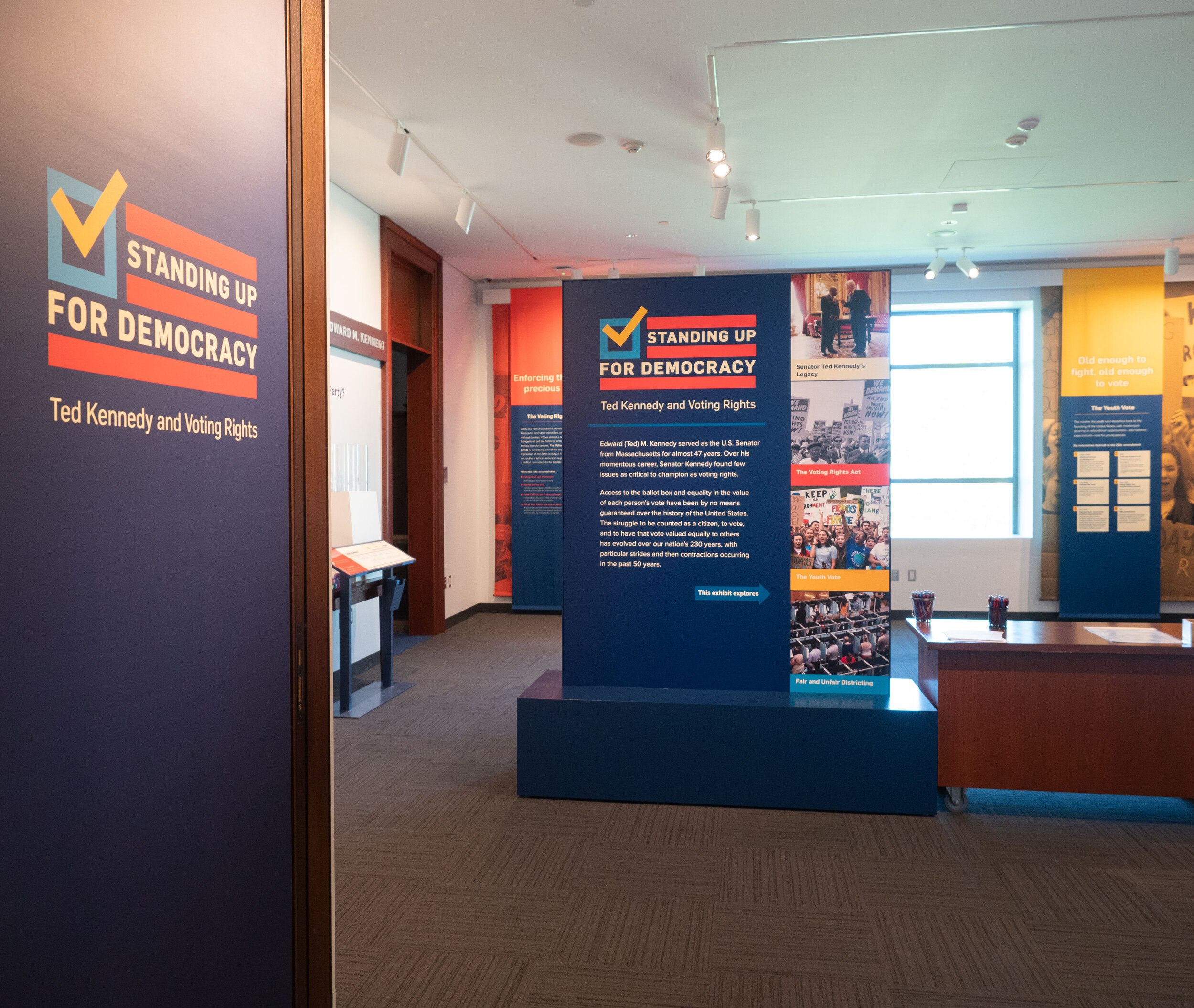
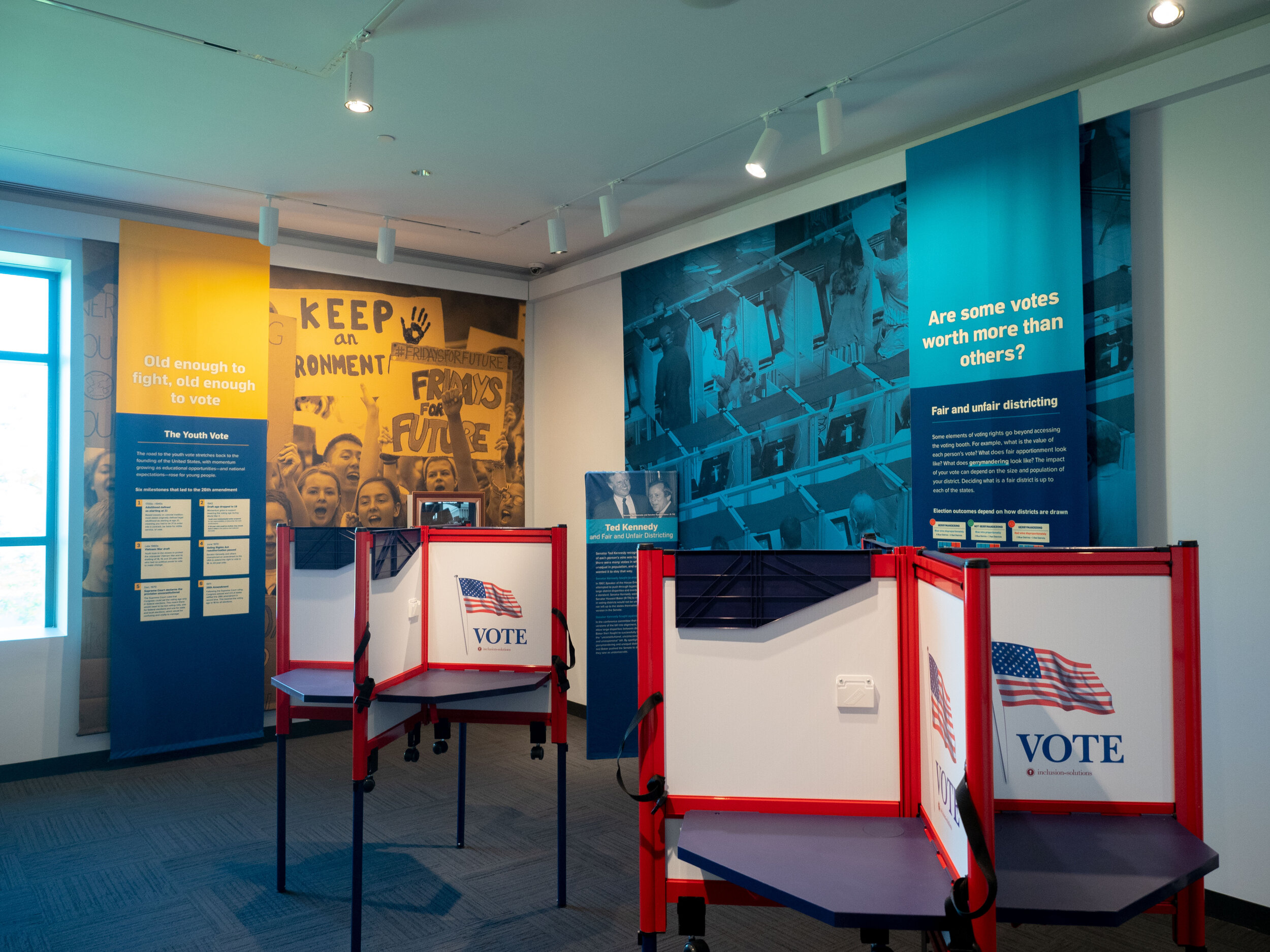
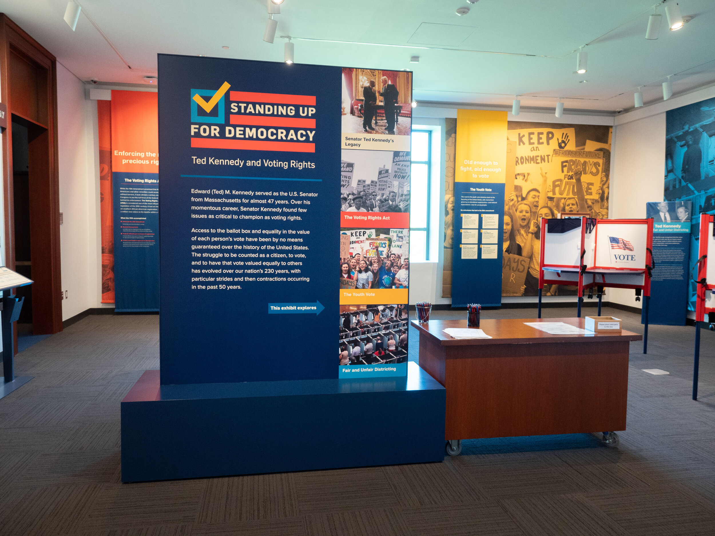
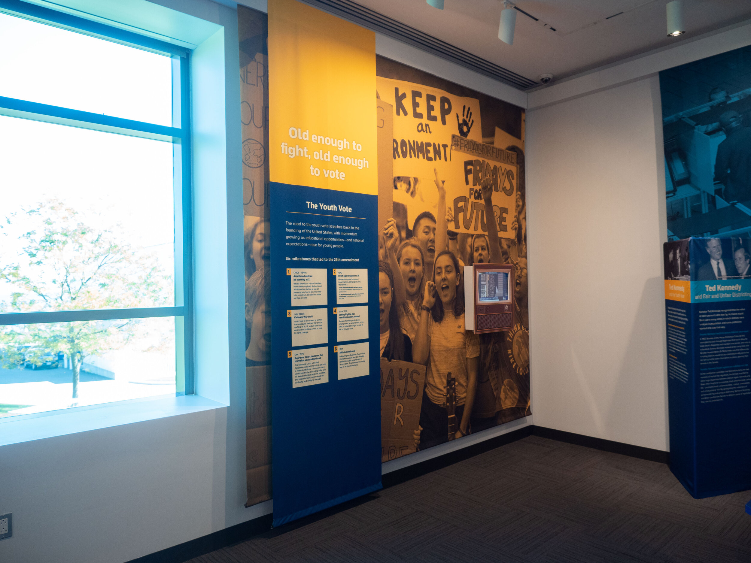
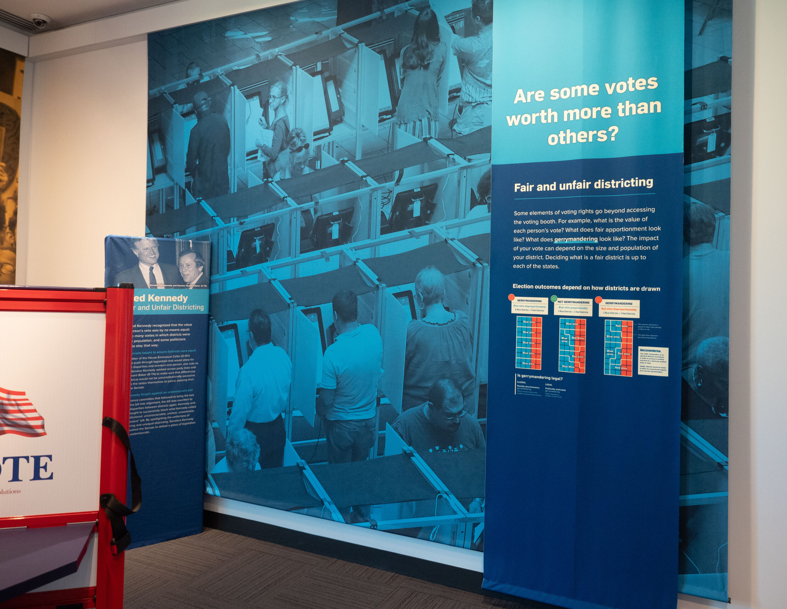
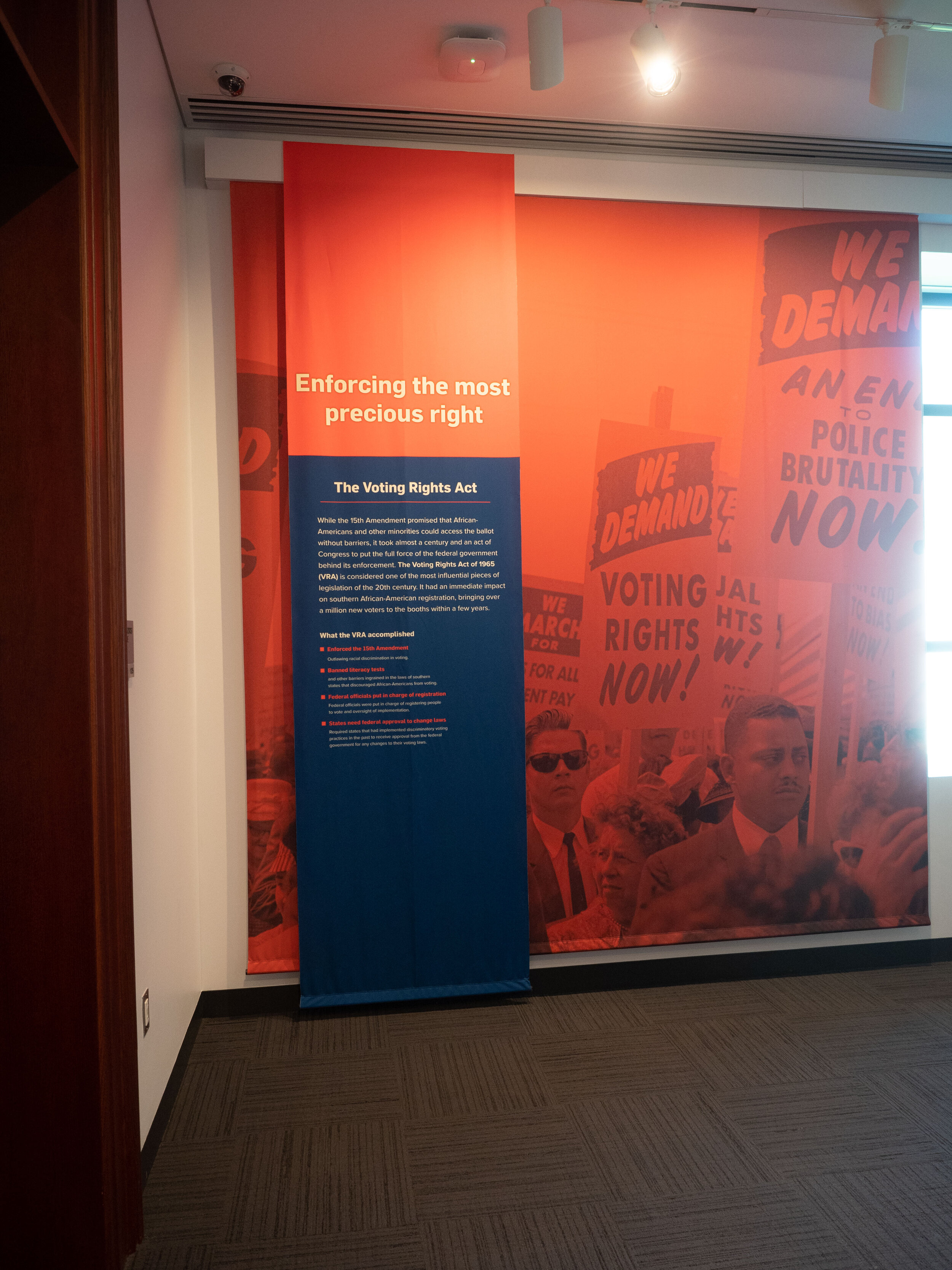
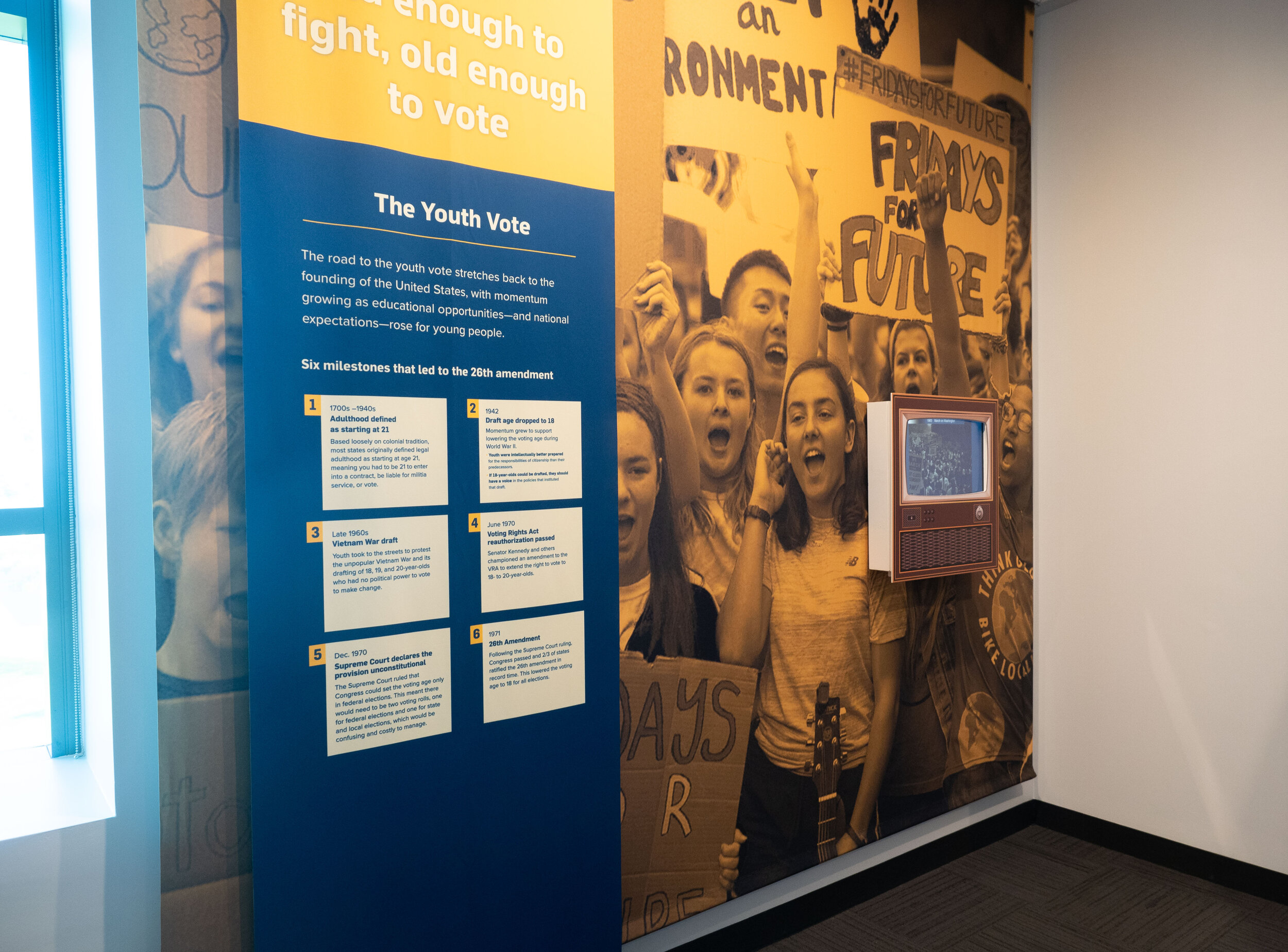
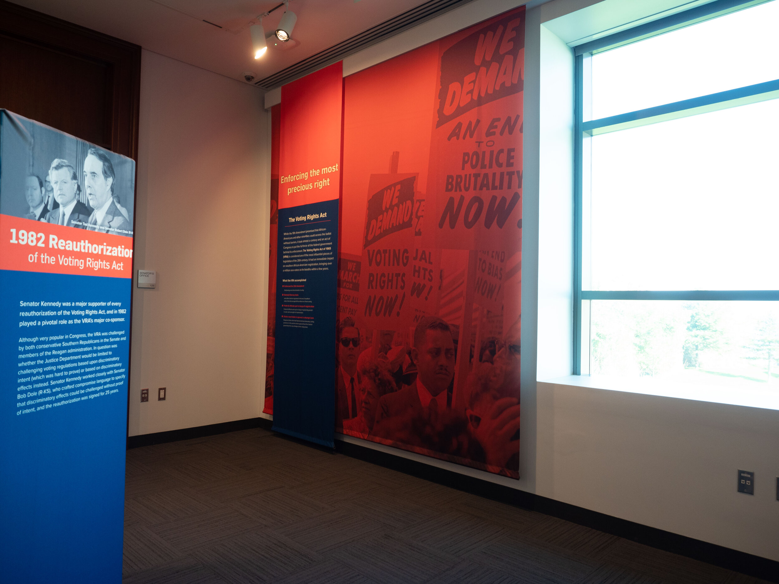
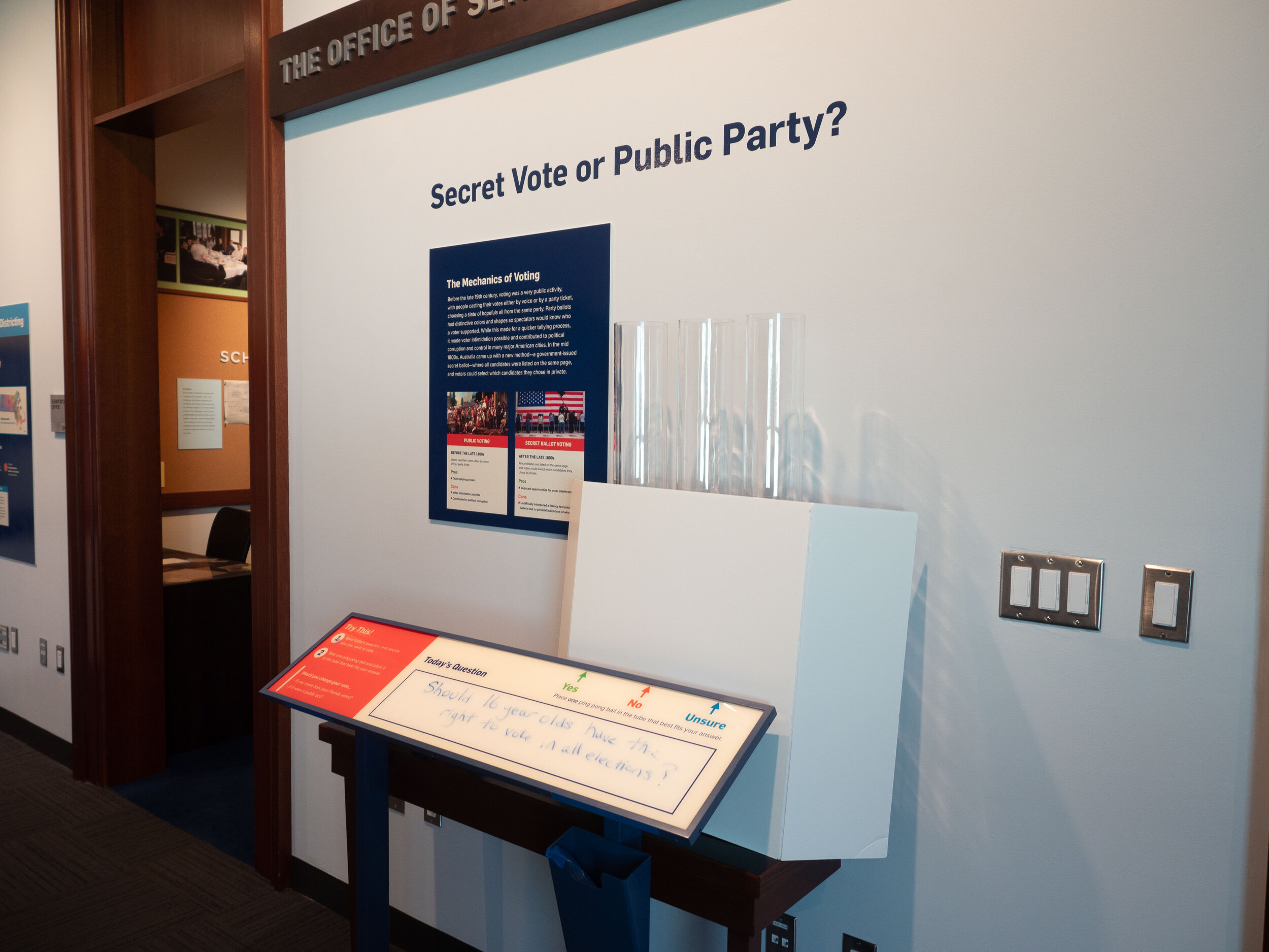
When designing an exhibit – we start thinking about the look and feel from the beginning. This process includes choosing colors, materials, fonts, and determining a style for photos and other graphics. For this exhibit, we wanted the look to be vibrant and the colors to be playing off the red, white, and blue of the US. The subject matter is pretty serious and so we wanted the vibrancy to balance that out. We chose to use photos relating to the three exhibit sections as large fabric backdrops. These provide an immersive feel at a relatively low cost.
The audience for this exhibition is primarily middle- and high-school school groups and we wanted to make sure the content would be eye-catching to them. We wanted to empower young people to be motivated to vote when they’re old enough so it was important to make the look and feel friendly and vibrant.