
Transit Matters Proposal One-pager
We were honored to work with the organization Transit Matters, a public transit advocacy group in Massachusetts, to design a one-pager that would summarize and visualize their proposal on how to improve the commuter rail in the Boston area. They will be using this one pager to communicate to the Mass. legislature about the need for and benefits from rail improvements. This audience will have some background knowledge about transit issues, but they didn’t want to assume a deep understanding, so we wanted to keep it accessible to a lay audience.
We worked closely with Transit Matters to determine what information should be visualized, how to organize the information to be accurate and clear, and how to design it to be understandable at a glance.
Below is more about our design process
step 1: organize
To start this project, Transit Matters gave us their multi-page proposal for changes to the commuter rail that they are presenting to the legislature. We read through this carefully and did an analysis on what the categories of information were present (for example: types of improvements, geographical information, timeline, outcomes for improvements, and reasoning behind suggestions).
From there we looked at how to structure a hierarchy for that information. By reading their document and speaking with their team we determined that the types of improvements, the geography of improvements and the outcomes were the most important information—and therefore what we wanted to communicate in the one-pager.
We created a spreadsheet (shown here) that we could fill out along with the Transit Matters team to make sure we had all the details correct for what improvements were being proposed, where they were located, and what outcomes would result from the improvements.
Transit Matters Written Proposal
Our spreadsheet to organize and collect information

step 2: Visualize
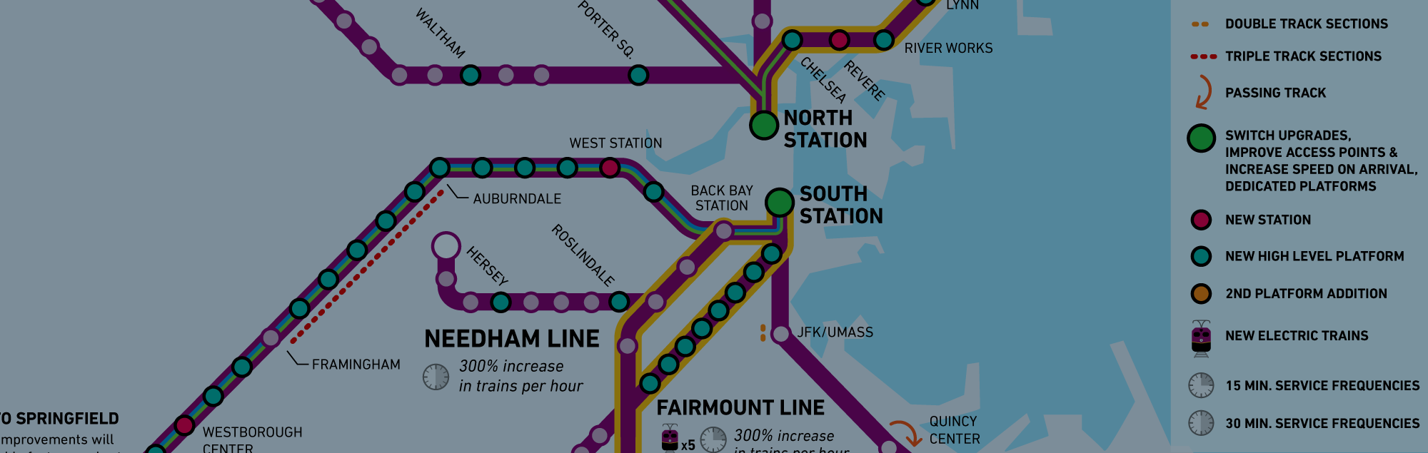
Once we knew what information we wanted to show, we needed to figure out how to visualize it. It became obvious that a map was the best way structure the front of the one pager – since the location of improvements was very important. From there we determined which rail map to base ours off of (there are many versions, some more simplified, some more geographically accurate). Ours fell somewhere in the middle of that spectrum.
After we designed the map structure, we sketched out how to visualize the improvements on the map and how to supplement the map and key on the front with more detailed descriptions on the back. We decided that it made sense to have small illustrations and additional descriptions on the back of the one pager for each type of improvement.
Step 3: Stylize
This final step involves making sure all the information is readable and accurate, the colors work together but are unique enough to stand apart, the illustrations are accurate and stylistically consistent, and that our original intent from Step 1 is successfully executed. True to the original intention, we are showing geographic information (the map structure itself), types of improvements (the color coding on the map and the key, as well as the more detailed descriptions on the back), and the outcomes of improvement (the information in purple on the back, which are connected to individual types of improvements).


Featured in the Boston Globe
We were excited to see our map featured in the Boston Globe Ideas section April 11, 2021.