
Designing for usability
We created printed materials for a series of in-person discussion groups on the topic of solar radiation management. Function was the primary design consideration for this project, we needed to ensure that the materials would support a productive and efficient discussion.
We designed the materials to be intuitive to use so that the participants could focus their mental energy on the issues surrounding solar radiation management. For example, the cards are color-coded by type, and the boards are designed with arrows and “place your card here” instructions so that the tasks are clear. Each piece has organized information, clear instructions, and room to write where necessary.
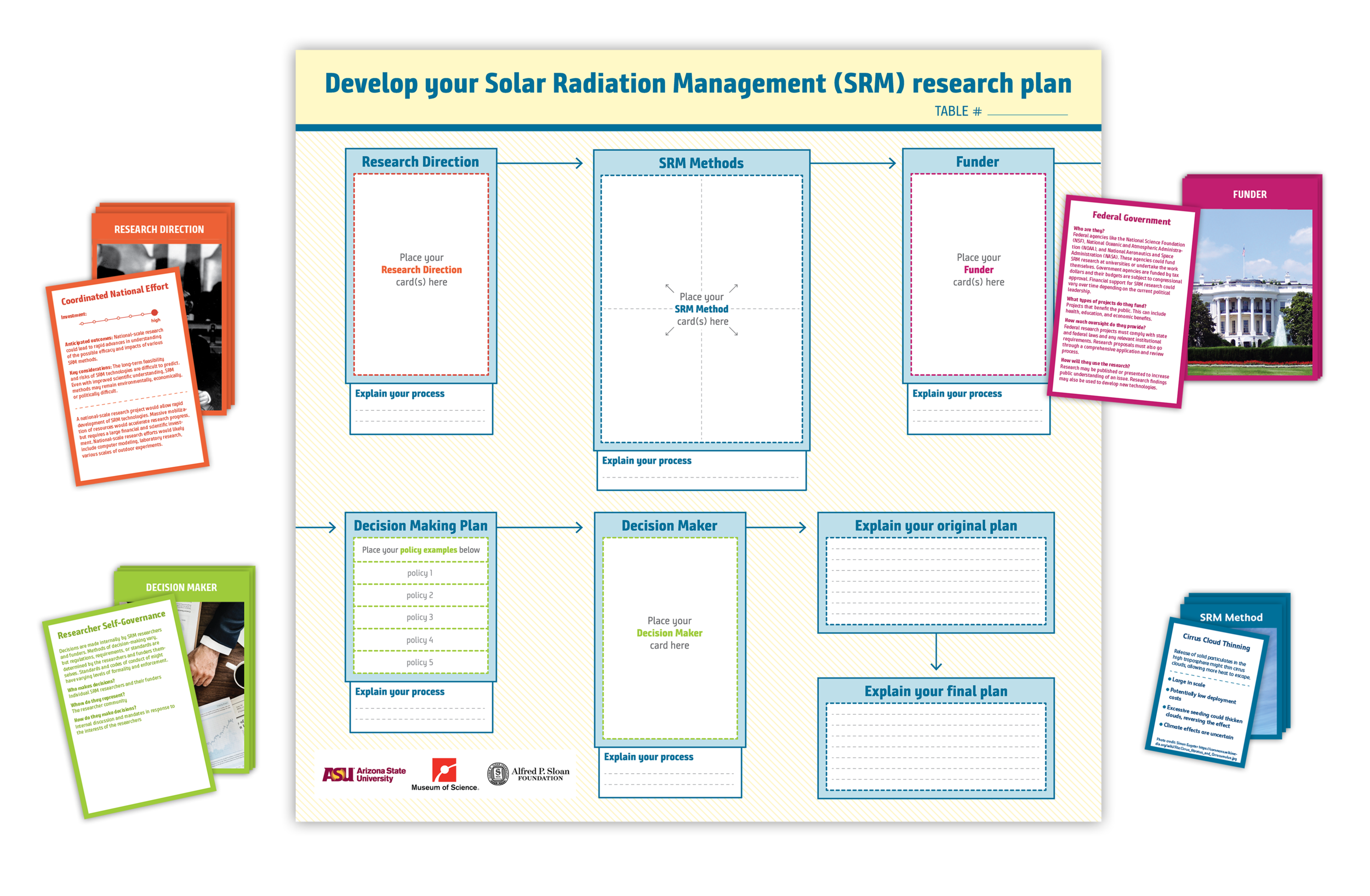
We designed a board that fit each of the cards, used color coding for clear associations, and imagery to accurately depict the content.
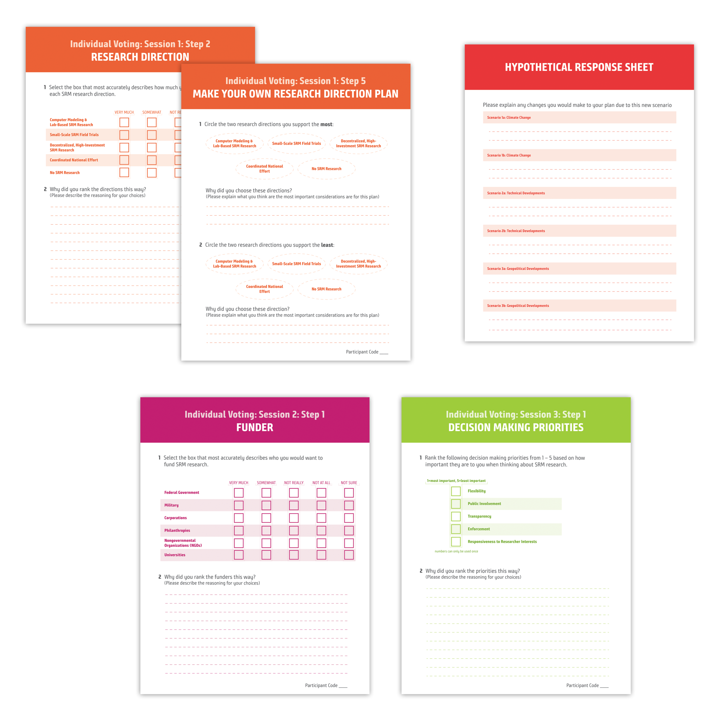
These are voting sheets that the participants filled out during the discussion. Each session was color coded for both the participants, and for the discussion leaders to easily organization the materials during the sessions.